Previous section: Labelling and Research
Cartografía en Español
Trying to translate geographic terms like Nevado de Huila, or Sierra Nevada de Santa Marta, was difficult. It’s easy to say, ‘Río San Juan’ should be ‘(The) San Juan River’, but for some of the longer terms, it felt deeply inauthentic, to take a name like Sierra Nevada de Santa Marta, and translate it as ‘The Snow Covered Range of Saint Martha’. Or should it be the ‘The Snow Covered Range of Santa Marta’, or ‘The Santa Marta Snow Covered Range’ or ‘The Santa Marta Range’?
All of them felt more awkward, and more of my decision making intruding onto the name, than if I left it in its original form, and avoided the decision entirely. Since this is a region entirely covered by hispanophone countries, the labels made the map Spanish, even before I made the conscious decision to make it entirely in Spanish.
I had been learning Spanish (slowly) for years, and I was already doing a lot of my reading for this map in it. It made for a tantalizing challenge to take the next logical step and designing the map fully in Spanish. Labels, annotations, extent maps, etc. It also felt more respectful and reciprocal to try and engage with this region in a language more recognizable to its inhabitants.
I listened to a lot of Cumbia while editing…
Working in Spanish made many aspects of map creation and research easier. It is easier to stay organized when you are reading, writing, and thinking about text all in one language, than to try and bounce in and out of it. That said, it was tiring in a way that people who are fluent enough to read, but not truly fluent, can understand. It takes real concentration to absorb information properly, and I had to take frequent breaks and re-reads to get all the right information.
Spanish, like any other language, has different registers of formality. Being able to talk to someone on the street, or read an advertisement, and write technical text are two very different things. For the explanatory text on the map was to write a first draft in my own, informal, semi-competent Spanish, editing it as best I could with the help of dictionary and conjugation guides, and then having my reviewers give it a pass-through to give a more natural, accurate sound.
Many terms needed revision, even if they weren’t outright wrong. I first wrote ‘font’ (ex. Helvetica) as ‘tipos de letra’ (lit. types of letters) but it is more natural sounding to a native speaker to say ‘tipografía (en este mapa…)’.
Map Design
I always intended the actual styling of the map to be as austere as I could be. The focus is the imagery, so I stuck to white as my only color, and only introduced others in the extent maps where those extra shades were useful for clarity. I initially tried to not even use transparency in labelling, but after print issues and some reviewer feedback, I relented and thickened fonts and used opacity more to highlight and accentuate certain labels over others.
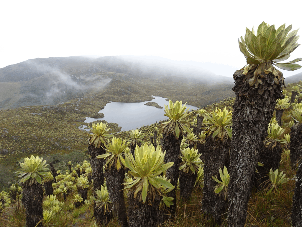
I snuck in small references to unique aspects of the geography when I could. For instance, I made the symbol for the Páramo, a distinctive high-mountain wetland ecosystems a miniature frailejón plant (lit. ‘friars’), an iconic species found in these areas.
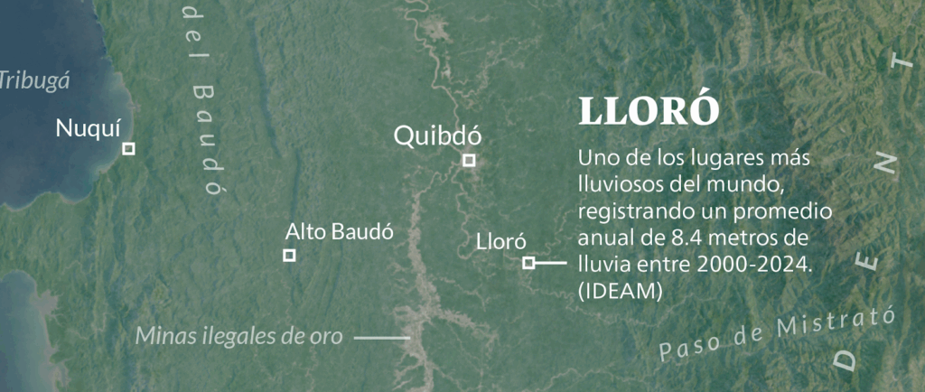
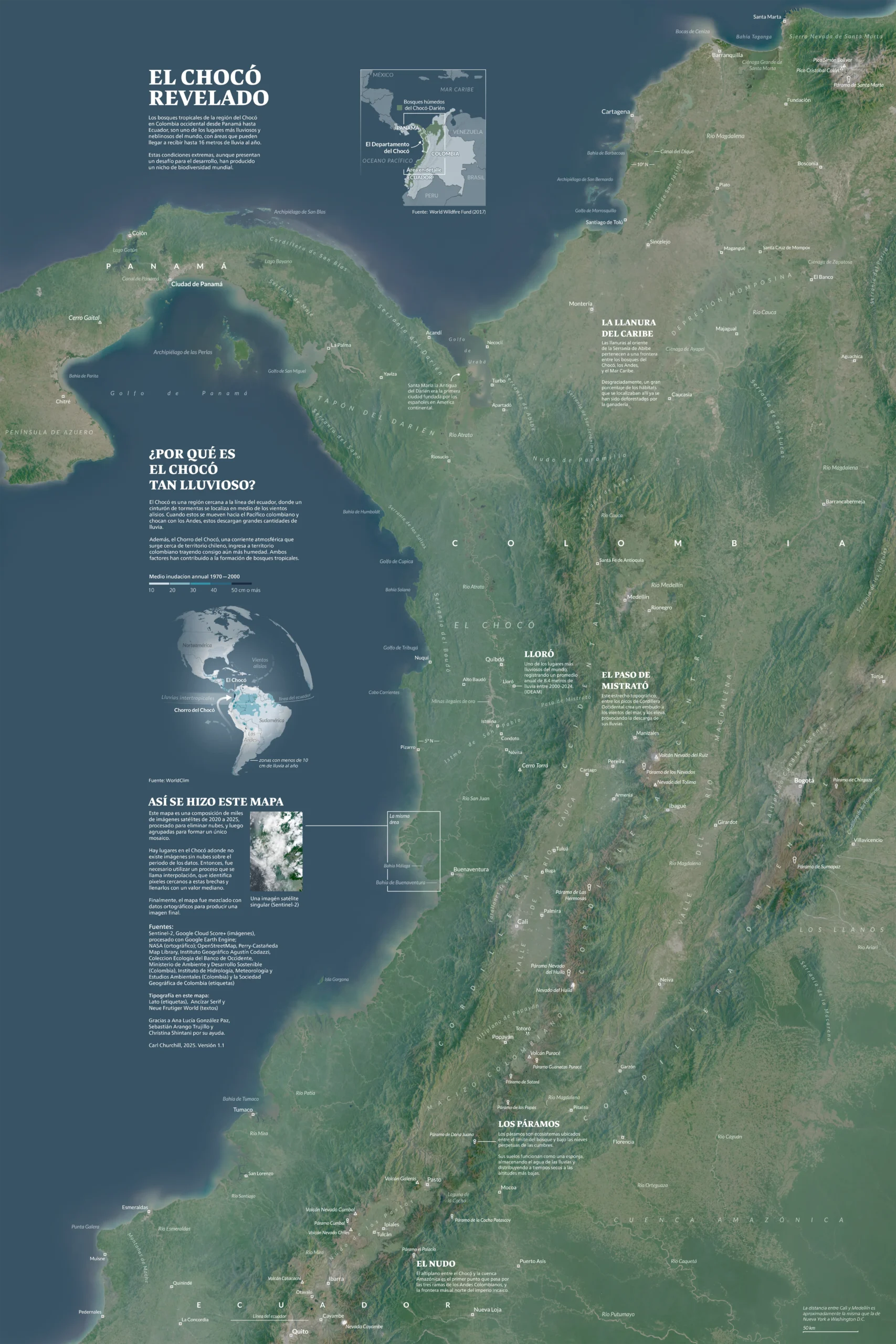
And of course, I called out Lloró, the town that started so much of this in the first place.
I was even able to find a uniquely Colombian font, Ancízar Serif, for the different headers in the map, designed by university students in Bogotá in 2014. You can try it yourself here.
I adore the explanatory blurbs of this sort of infographic style, but I added them as sparingly as I could, always trying to weave the text around what I wanted the map to be centered on – the landscape itself:
I was able to present this map at NACIS 2025 after all, and only found myself making minor edits afterwards – though I am certain work still remains, and intend to slowly update it as, or when, I receive comments or learn more information.
Al final…
I confess, it feels weird to have undertaken so much work on behalf of a place I have never been to, or anywhere near, that I have no personal attachment to, and only came about because I noticed something odd in google maps last year.
Mapmakers and journalists go through similar processes all the time. I take it as a perpetual reminder of how little you actually know. I can not ever say I know these places, but I feel less ignorant than before. And that’s enough. Saludos!
Download the full-sized map
Google Drive link (one compressed 7 MB file and a full-sized 40 MB file)
An immense, and special thanks to:
Ana Lucía González Paz 🇨🇴 , Sebastián Arango Trujillo 🇨🇴 , Marco Hernandez 🇨🇷 , Christina Shintani 🇺🇸 , Scott Reinhard 🇺🇸 and Rob Simmon 🇺🇸 .
Much of the leading research on the climate of the Chocó has been due to Dr. Germán Poveda (U. Nacional de Colombia), without whom’s work this article would be a lot shorter.