Previous section: Interpolation
Making the Map
I had submitted a plan for a 36×24 poster at a map conference months before I even finished the script to motivate myself to produce results. The map was only submitted as ‘The Chocó’. At the time, I assumed it would end up as a blown up demonstration of this cloud-free imagery..somehow.
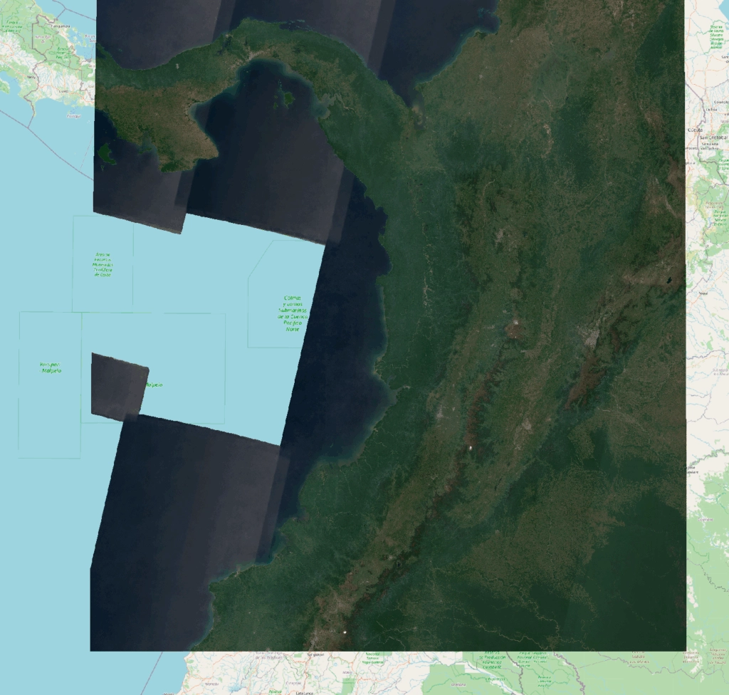
I drew the export bounds of my image in Earth Engine and tried to get a good crop when I realized that any appealing box I drew to cover the Chocó also inevitably covered swathes of other areas.
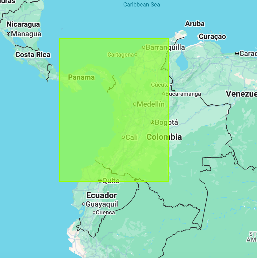
To avoid cutting off any land at the top, and because the coastline here juts out south and west, my bounding box ended up covering 2/3rd of the entirety of Colombia, Panama, and Ecuador (and a tiny piece of Peru).
(¬_¬)
This turns a focused tech demo of a single region into a map of the entire northwest corner of South America. It also introduced landscapes that my hyper-specific rainforest script was not suited for.
Color Correction
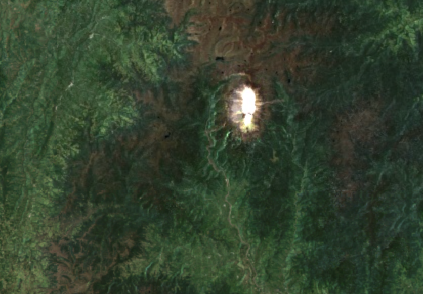
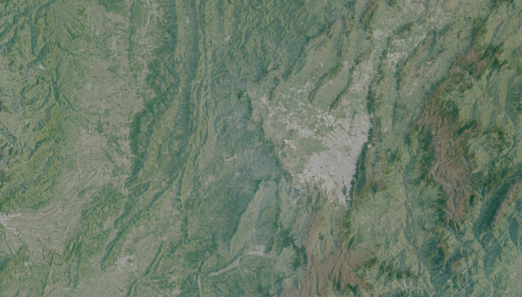
My script worked great for the Chocó, but because I was now looking at huge areas beyond the jungle, I ended up dealing with the other great enemy of satellite mosaics – snow. Colombia, despite being just above the equator, has glaciers and snow-capped mountains. One, the Nevado de Huila, is only about 75 miles (or 122 km) from the coastal rainforests in Nariño (one department south of Chocó and part of the same bioregion).
This mountain’s white cap has extremely bright visible light values, and gets maxed out by any color stretch you apply that doesn’t also make nearby rainforests impossible to see.
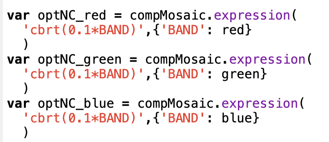
Luckily, I had a packet of color correction algorithms I could slap onto this, my adaptations of some Sentinel-2 scripts written by Marko Repše and Gregory Ivanov. You can read the original descriptions here.
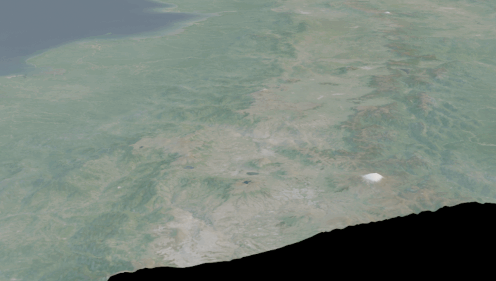
All these do is apply some mathematical formulae using GEE expressions to the different RGB bands, restretching the levels of each band into more aesthetically pleasing distributions. The simplest correction applies a cube root transformation to each band:
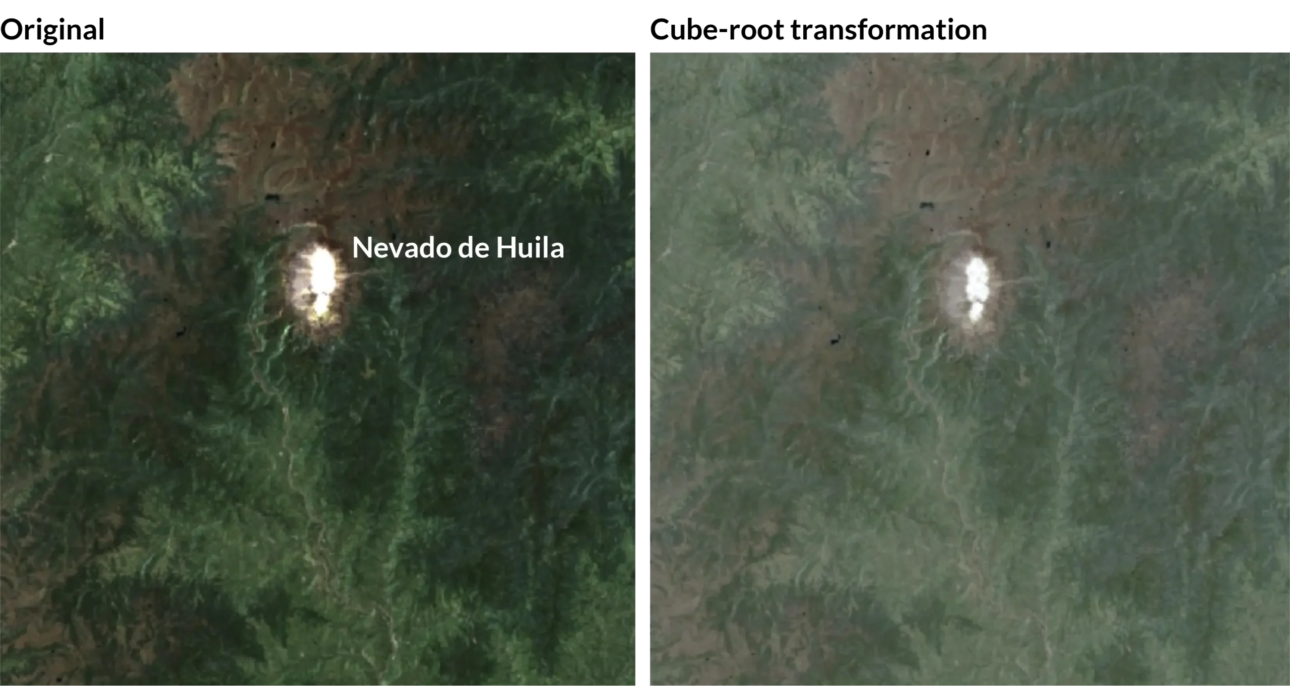
A cube root transformation in effect pulls a skewed distribution closer to a more normal one (source). Applying it to the Nevado de Huila did a good job of pushing all the levels together towards the center:
When I loaded the final corrected mosaic in QGIS, I admit to just staring at it for a while:
I liked its look so much, I wanted to keep any further changes to a minimum. I manually cleaned up patches where even the interpolation couldn’t fully cover the data hole, a few spots where imagery strips intersected, and I covered the jagged imagery bounds in the ocean with a solid dark blue.
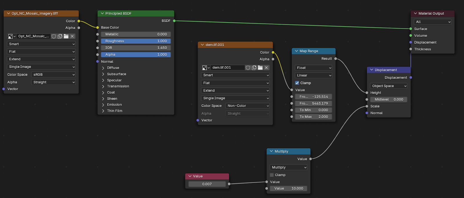
I then passed the map, because I simply could not resist, through Blender. I did not want a stark ‘Blender’ look however, so I only gave enough exaggeration to the terrain to accentuate the natural relief, like the mountainous landscape around Bogotá (Colombia’s capital):
Even at a 10x exaggeration level, the scale of the landscape horizontally still dwarfs the height of the tallest mountains, when viewed at an angle inside Blender:
I have spoken before about how to set-up elevation properly inside Blender, most recently at NACIS 2025. You can watch a video of that here.
I will leave the details to that, but the gist is that I first scaled my landscape to accurate proportions, and then cranked it up enough that the shadows when viewed from above were visible on such a large scale, but not so much that they blacked out parts of the map.
There was a short second round of color correction at the end as well to counteract some washing out Blender did when it rendered the map, but then that was it. Time for labels.
Next section: Labelling and Research