Mountains dominate the conversation around terrain. The Swiss Alps were the study for the great 19th and 20th century masters of shaded relief while today the Rocky Mountains, Himalayas, or even the desert vistas of the southwestern US are visited again and again by cartographers eager to display their chops. There is nothing inherently wrong with this, but it adds to, and reinforces, a idea that flatter landscapes have less ‘terrain’ than a dramatic mountain vista. Even in pop culture, we joke about how flat a place is as a pejorative term. Americans envy the rugged vistas of Colorado, Alaska, or California, and mock Kansas, Florida, and Illinois as boring, plain, or even simply ’empty’, as if they fundamentally lacked landscapes.
Obviously this is not true. The entire earth has terrain, but why do we in the modern (Western) cartographic community show such a preference for mountains? Its both a technical and psychological problem. Flatter landscapes get short-changed in terrain maps because it is harder to convey that grandeur using the typical (digital) cartographic arsenal. Nor are flat landscapes truly flat. Their contours are just more difficult to see than a dramatic mountain ridge.
Part of this difficulty is because of how we perceive a landscape. Humans are tiny relative to most physical features, and we are looking at those features at a very very low height. Tall mountains are easy to see on the ground, but the larger forms of equally vast but lower-lying landscapes escape unnoticed. A perfect example of this is the so-called ‘Eye of the Sahara’, or the Richat Structure (Guelb er Richât / قلب الريشات ):
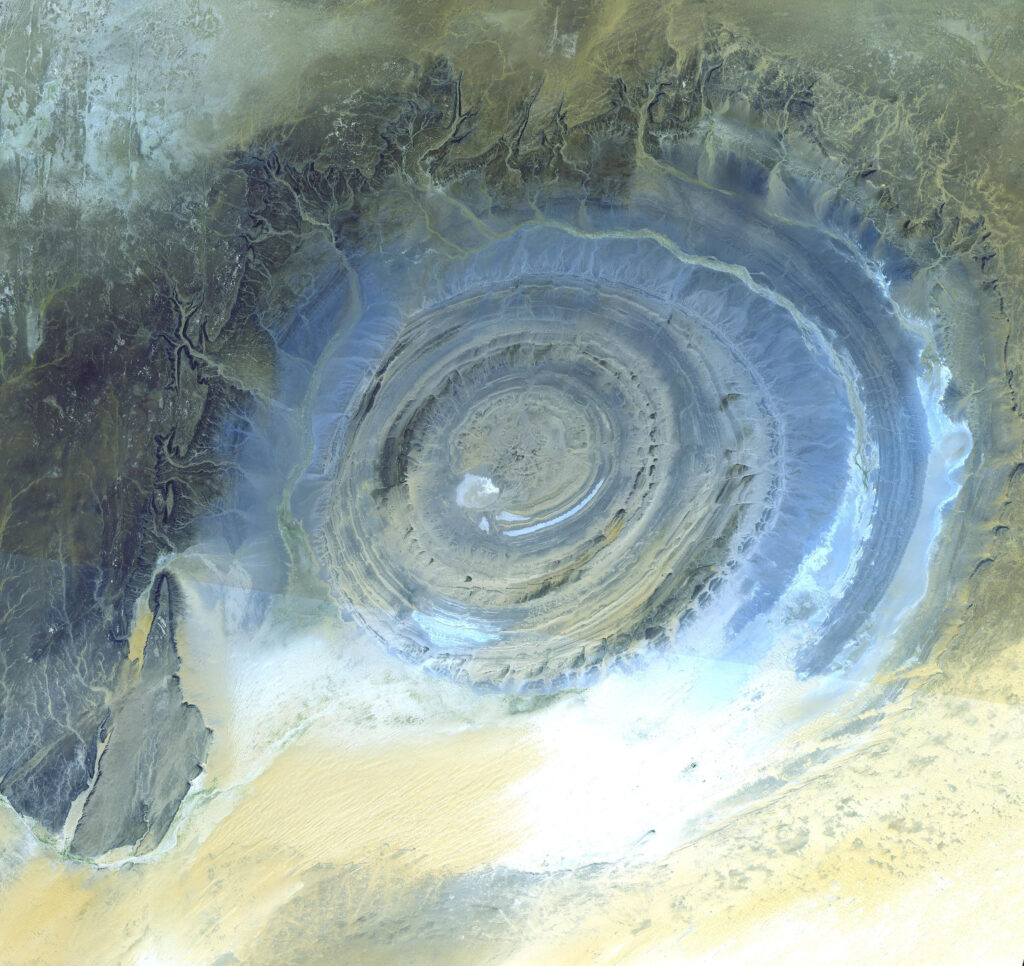
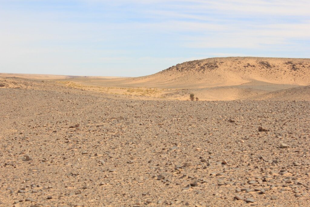
This collapsed salt dome in Mauritania was little known until aerial imagery captured a different angle of it than any human had ever seen before. It has since fueled all sorts of fascination and speculation. More than once someone has forwarded me a YouTube video claiming it as the ruins of Atlantis, which makes sense if you see it from space. However, here is how it looks on the ground, as a ancient human might have seen it millennia ago:
The true grandeur of the Richat Structure escaped us until very recently, but aerial views only capture it so well because they are showing its color, not the bare terrain contours alone. Here is a conventionally rendered hillshade of the structure and the surrounding Adrar desert, without color:
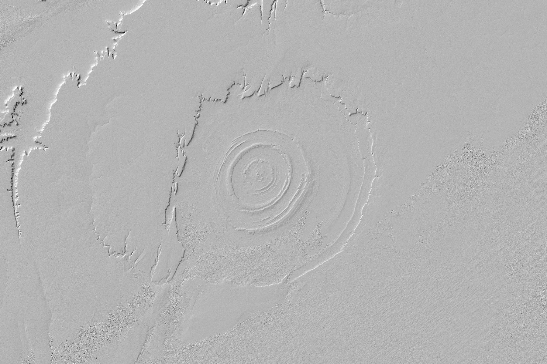
In monochrome, the Richat Structure appears as a series of low hills in a dull grey expanse. Also, if one needed to take this and use it as the base of a map, the color range is so thin across most of the image (except possibly some of the gulleys to the northwest), that it would barely show up over any other layers. Here is the hillshade from before with a satellite image (Sentinel 2) placed over it:
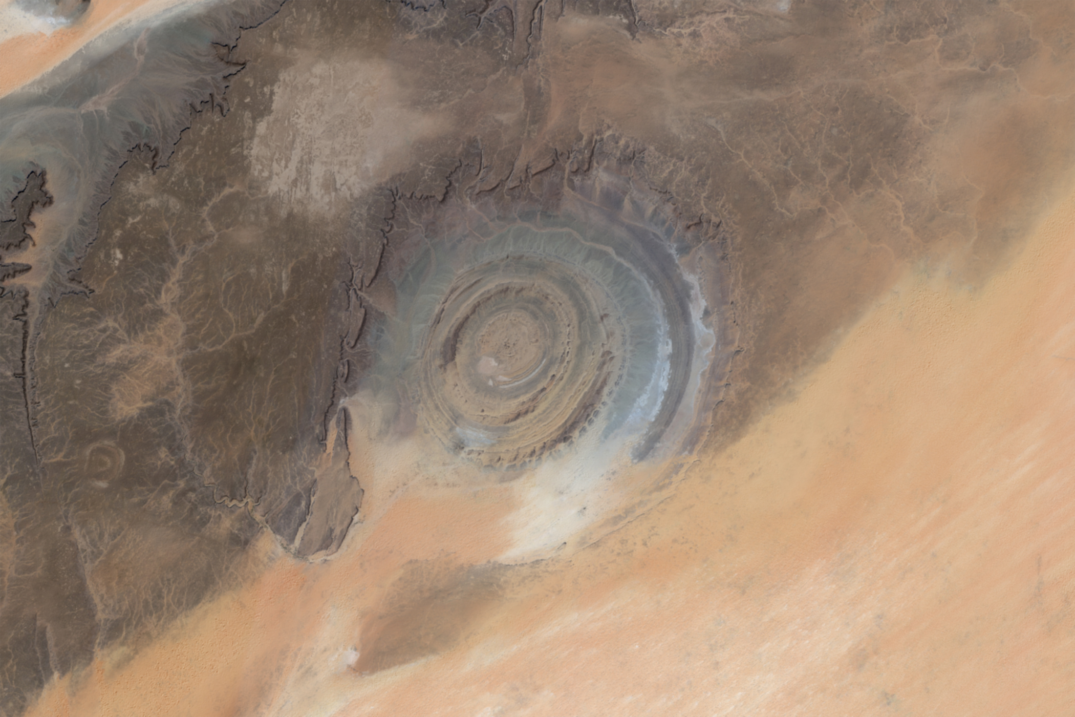
Yet, even the low eroded hills of the Richat Structure appear in a hillshade. They are still, of course, hills, and taller than a human. A more extreme example of how much terrain data is lost, and one that I have to deal with constantly, is in river deltas.
A river delta is wide, low, and constantly changing. As a river deposits sediments it fills old channels and cuts new ones, fracturing into thousands of tiny undulating streams. This sort of landscape is extremely flat. It is a dynamic, interesting area all trapped between 10 feet of elevation. A conventional hillshade will lose most, if not all, of these channels.
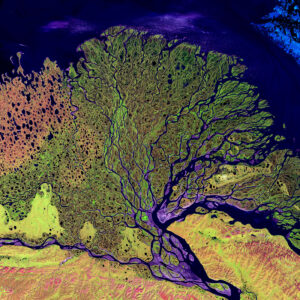
Look at the transition between a satellite image of the Lena Delta in Siberia with a hillshade of the same area:
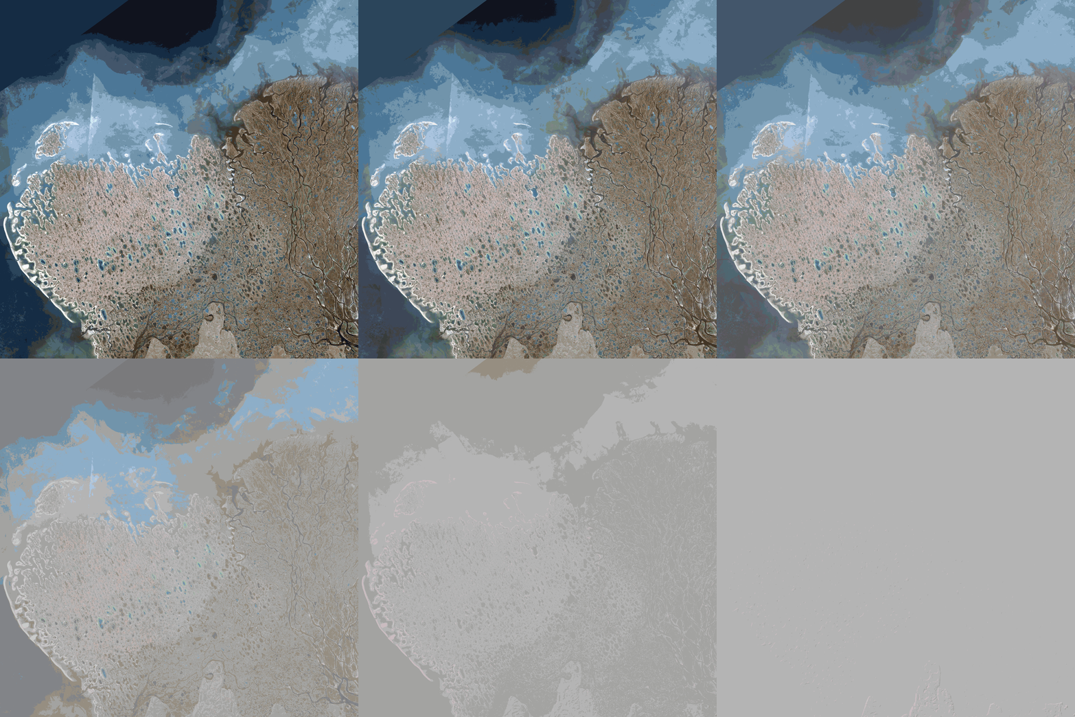
This is the crux of the problem. We can see the terrain is there, and a DEM can capture these elevation changes, provided it is of sufficient resolution, but having the data is different from seeing it clearly. A hillshade displays color per pixel according to how that pixel interacts with a light source, but areas 2 feet apart in elevation will seem indistinguishable compared to more dramatic elevation changes say, in a nearby mountain range. These differences do not seem important when mapping more rugged terrain, but they hide lowland areas.
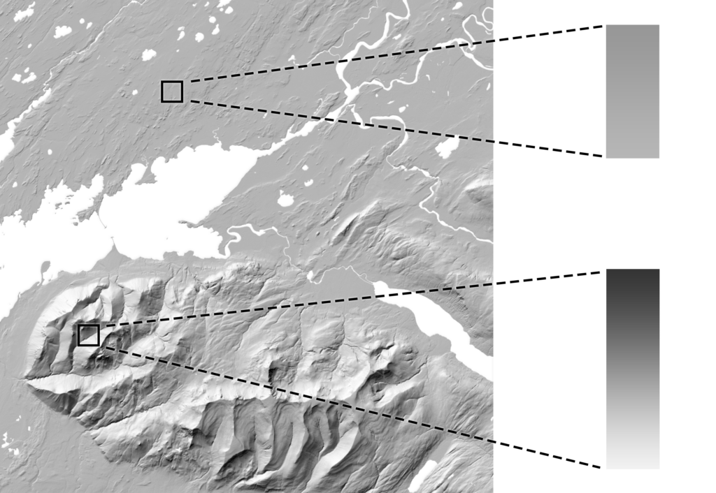
The solution is like climbing a mountain. On paper: easy (go from the bottom to the top), but actually doing it is the entire challenge. Here the solution is to take those subtle elevation changes and make them appear more distinct, but how is this actually accomplished?
Luckily we just have to do some basic math, and even luckier we have software that does this for us. All raster images are grids where each cell (pixel) corresponds to a higher, or lower value. Naturally in a DEM areas with similar elevation will have similar values, and any rasters generated off that DEM (i.e. slope, hillshade) will have similar values as well. We can think of these rasters with a histogram, showing which values are more or less common. To maximize the difference between nearby areas, we can use a tool like Equalize in Photoshop to stretch that histogram like so:
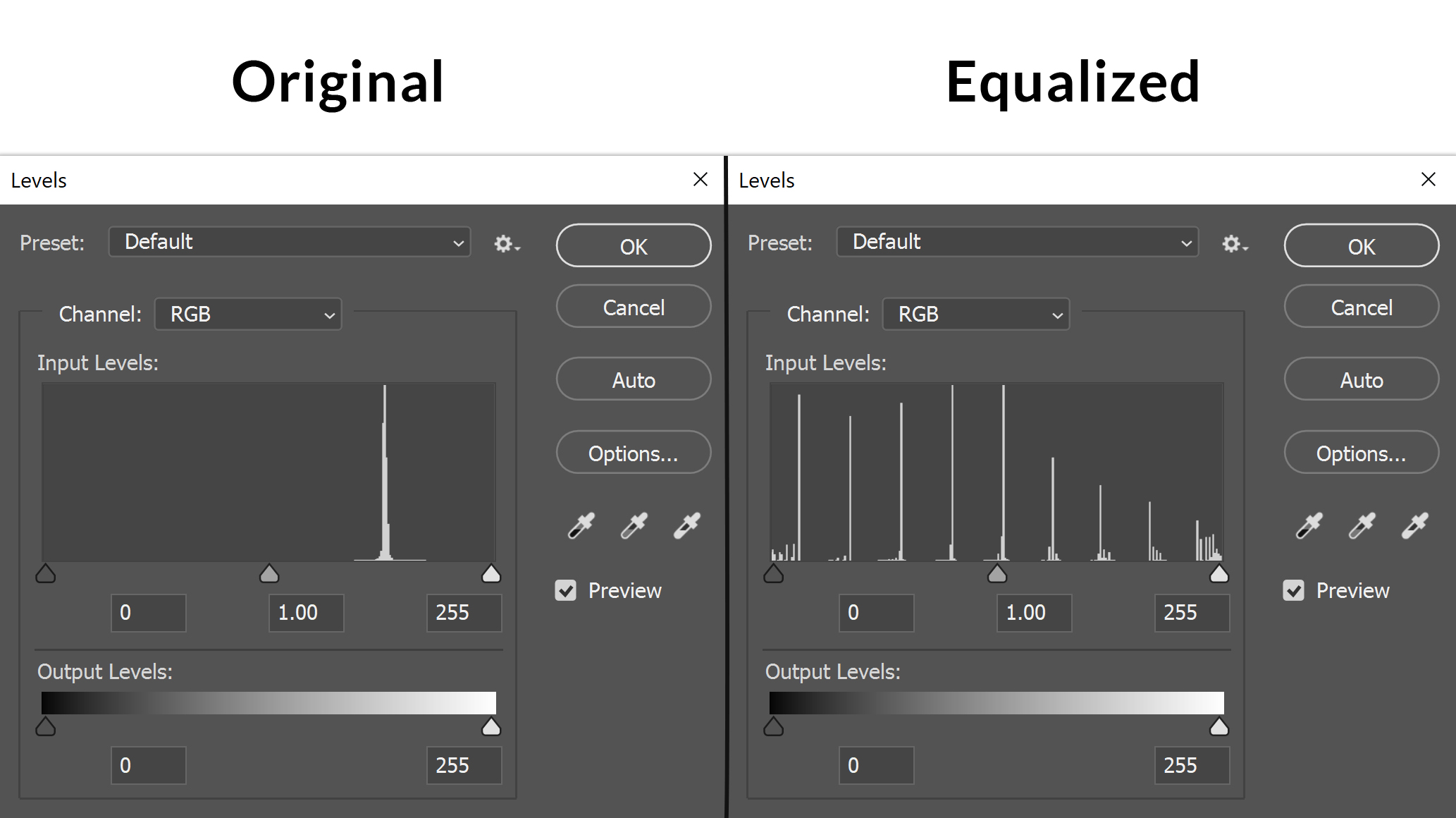
This sets the highest value on the grid as pure white, and the lowest value as pure black. This pulls out every possible detail in a raster. Its a great way to see what information is in the raster in the first place, and then you can blend that information in to highlight otherwise invisible features. The secret is applying it subtly, as equalizing a raster also makes it extremely over-contrasted. (You can also use the levels tool in the same panel (Image / Adjustments / Levels) to make more specific stretches).
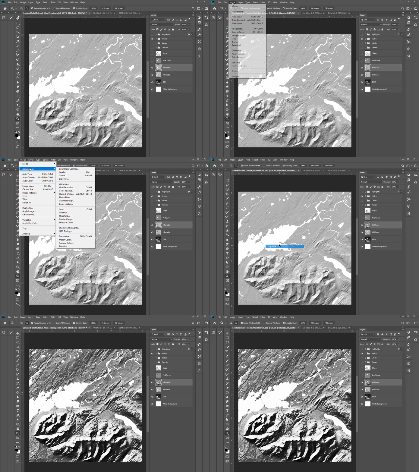
Equalizing a raster gives you more information to work with, but blending it is how you actually apply that extra information in a aesthetically appealing way. What sets Photoshop (and QGIS) apart from ArcGIS (for now) is blending modes. These are mathematical equations applied to pixels between different raster layers. Some have self-explanatory names like multiply (which multiples the values between two rasters – resulting in a darker image blending both), while others ex. linear burn are a bit more arcane.
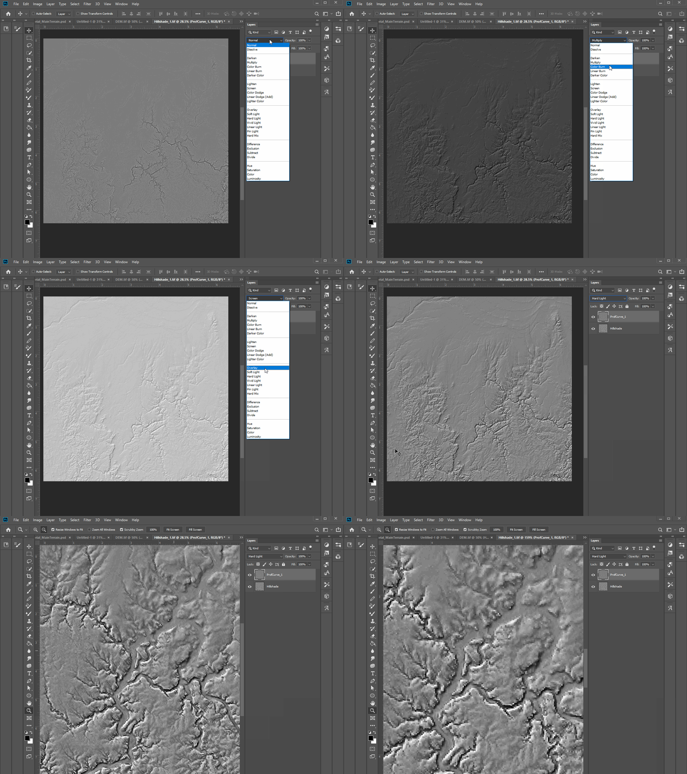
For shaded relief, I only use 4 – 5 regularly. Multiply, Linear Burn, Overlay, Soft light, and Hard light. These all blend terrain effectively but are appropriate in different situations: Multiply and Linear Burn both result in darker images and are useful for early stages when you are just building the relief. Linear Burn has more extreme shadows while Multiply is more muted.
Overlay, Soft light, and Hard light all are good for subtle blending and result in generally lighter images. Hard light also highlights hard edges very crisply, useful for adding in texture. You are encouraged to play around with blending modes and find what works for you.
Making the Map
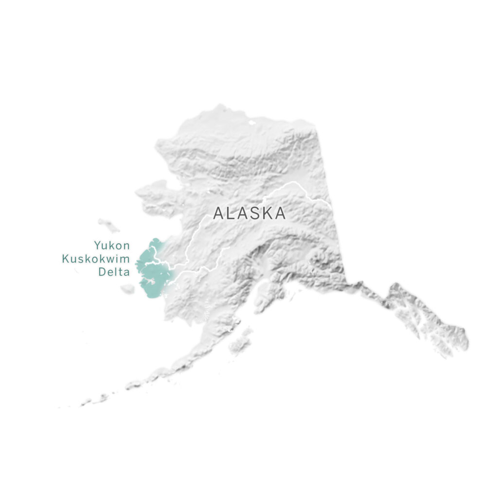
For this demonstration I am going to showcase a area that I first developed many of these techniques on, the Yukon-Kuskokwim delta.
The Lay of the Land
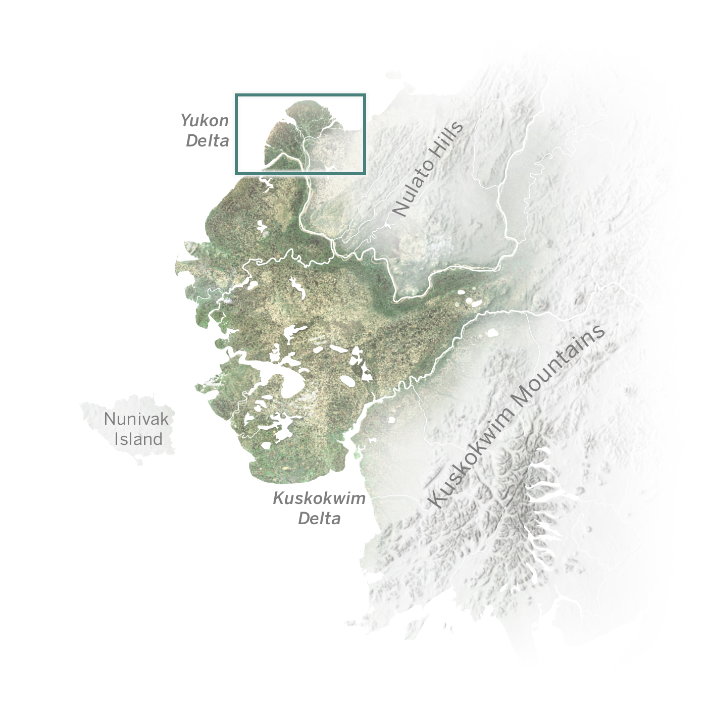
The delta is a broad coastal plain that extends between the two aforementioned rivers as they empty into the Bering Sea. It is covered in thousands of small lakes and streams that result in erratic terrain that looks like few other places on earth.
It is also massive – about the size of Louisiana. This landscape is overwhelmingly open tundra wetlands, with trees and shrub-land towards the foothills to the south and east. This landscape is the home of the Yup’ik, Cup’ik, and Athabascan peoples.
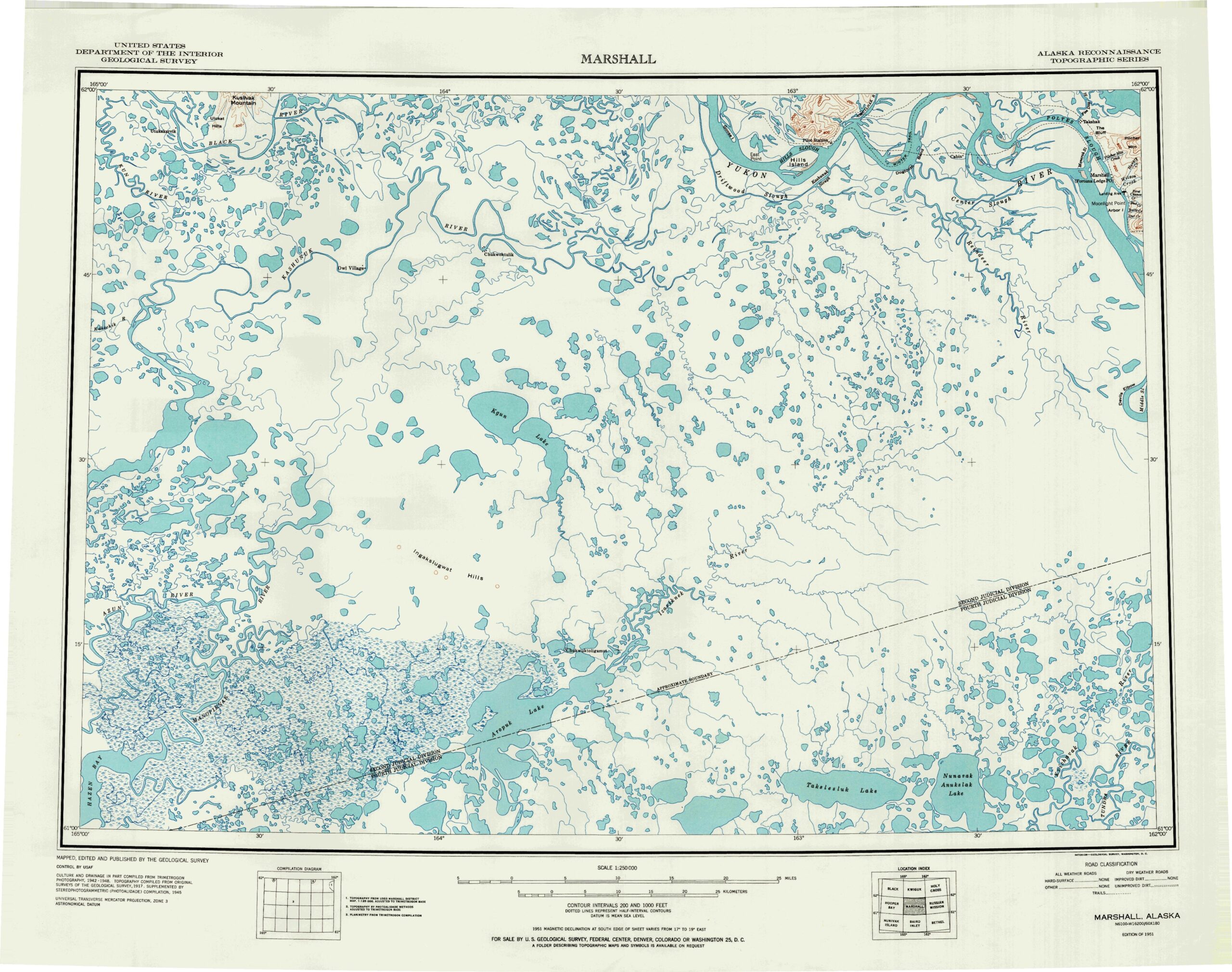
This tutorial is going to focus on just the Yukon delta proper, a distinctive fan that spreads out at the northern end of the larger plain. This shape speaks to the history of the landscape: as the river dumps sediment ever outwards it spreads the land out, laying slices of new soil almost like tree rings.
Composition
If we look at the delta itself with satellite imagery (here as earlier I am using Sentinel 2 images), we can see some similar patterns to other deltas across the world.
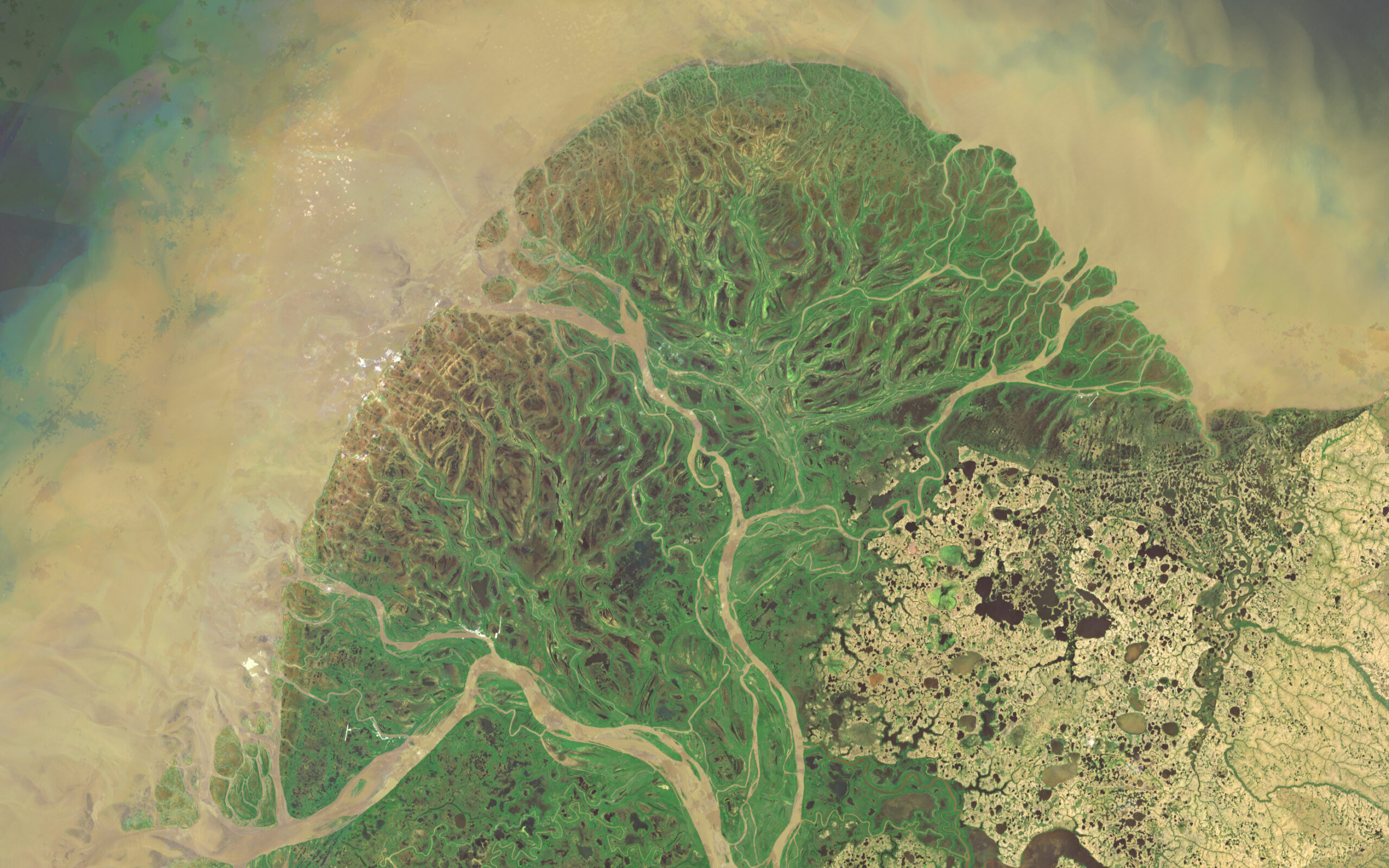
The Yukon river breaks into many smaller channels between a low-lying, waterlogged marshland. You also see to the east some more uniquely Arctic features such as the many small round lakes formed by shifting permafrost. Farther eastwards are the foothills of the Nulato Hills, though it is hard to see the elevation change from imagery alone.
If we look at this terrain now with a standard hillshade, all of the gorgeous terrain visible in the imagery seemingly disappears.

In fact, it might be hard to notice that this hillshade is showing anything at all if it weren’t for the slight rise in elevation around the Nulato foothills (bottom right). However, everything we saw earlier in the imagery is still here – its just hidden. 90% of this landscapes terrain is inside such a small elevation range its practically indistinguishable. The first step to making better terrain is to find out what we can work with. This is where the Equalize tool comes in.
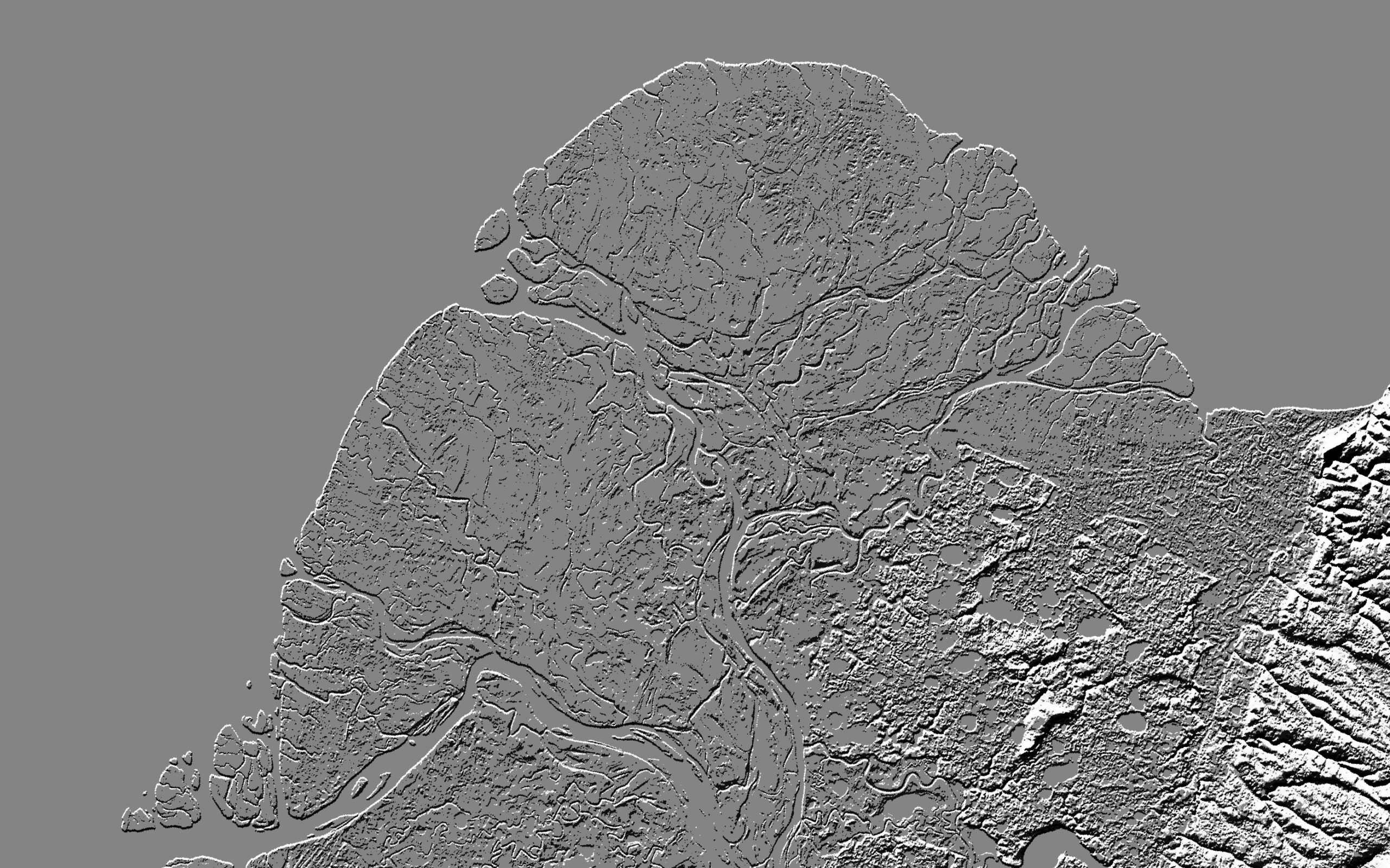
Much better, but now there is a new problem. The data is too extreme. Its too contrasted. Theres also some low-level contours we will miss if we just use a hillshade so to stretch the available data we can work with I am going to drop in a curvature raster (profile curvature here), and equalize that as well. I have covered curvature rasters in other tutorials, but basically they capture the second-derivative of a slope. Curvature rasters can be generated in ArcGIS Pro, and are great for capturing dramatic local changes in slope and aspect. I am using a profile curvature raster as that captures horizontal change well and is perfect for picking up subtle changes over a wide flat area.
Note: the lighter grey corner is because of a gap in the terrain data. Luckily it will be covered up by our water layer later so I decided to ignore it.
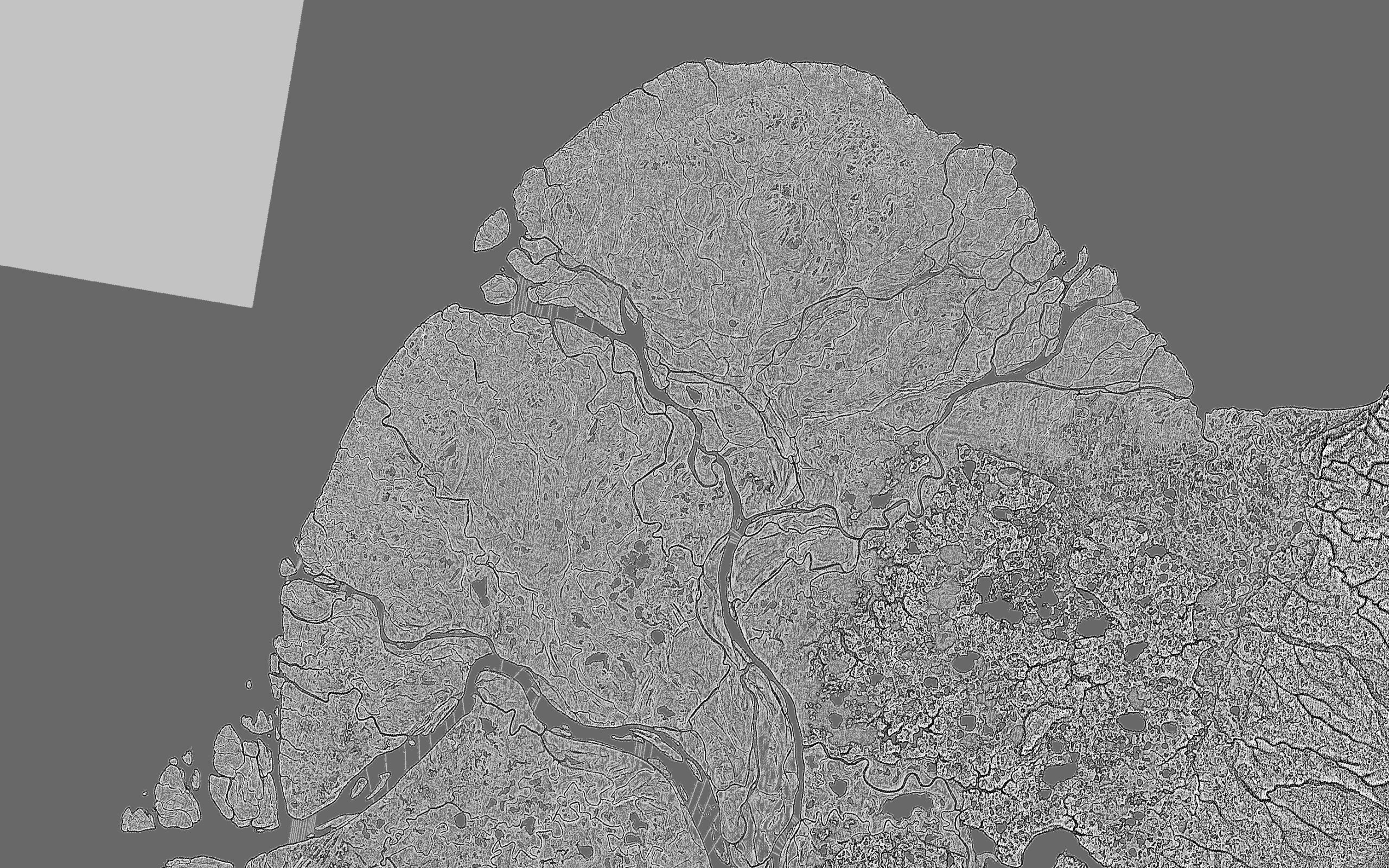
This shows every tiny channel beautifully, but it is too noisy just as the hillshade was too over-contrasted. Its by combining them that we will get a good end product.
Normally I use a combination of blurring and median filter but recently one of my coworkers experimented with paint filters in Photoshop inspired me to try out some experiments. I settled on using the Reduce Noise filter (Filter / Noise / Reduce Noise), which in my mind accomplishes the same task, but I have more control over the end product. It sums up noise in the image while leaving larger features untouched.
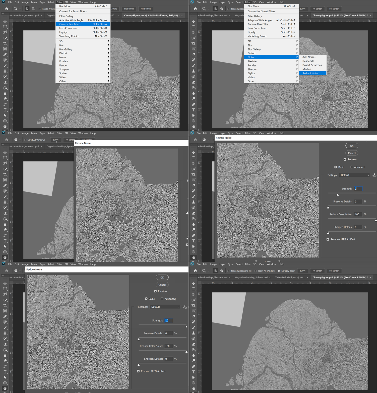
The trick is to apply it very lightly, and to remove any excess ‘painterly’ effects afterwards with blurring. Its always better to have terrain be a little too blurry than a little too crisp.
After applying my Reduce Noise filter and some blurring to both rasters, I then blend them together using the soft light blending mode (you blend them by leaving one as normal and blending the other over it).
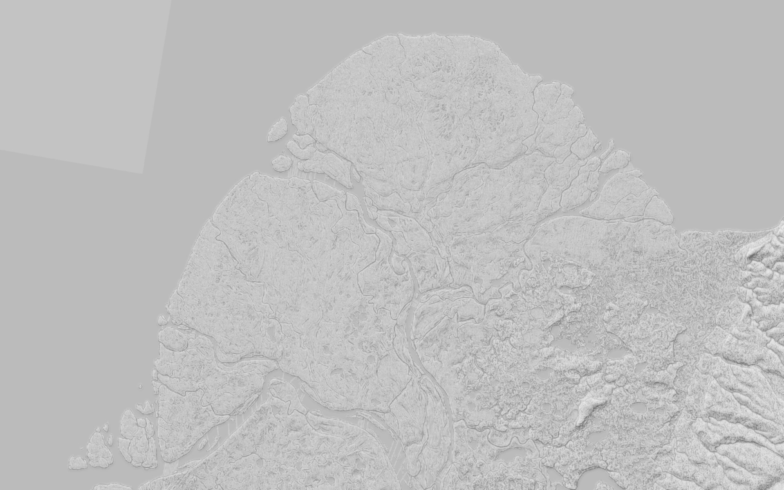
Already we are very close to the end product, but I want a bit more definition around some of those hills, so I am going to pull in a slope raster, and increase the contrast a touch with the levels tool, and then blend that in at 30% opacity with a soft light filter. This makes the lowland areas a bit brighter, and adds some good shadows around the steeper slopes.
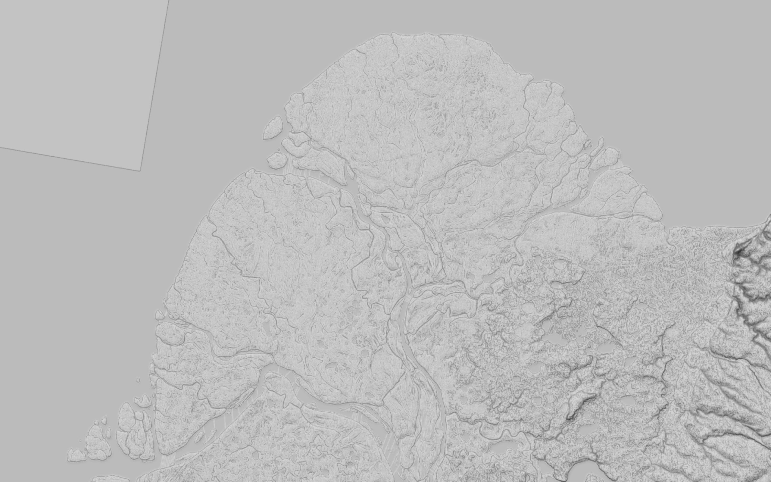
The terrain is looking good now, but its still too dark. Luckily this is easy to adjust with the levels tool.
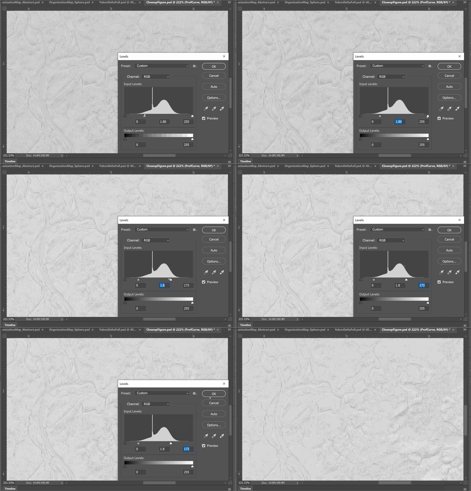
I pull the upper two markers to the left to make the highlights and median values lighter without modifying shadows. This leaves me with a bright image that still has good contrasting shadows to identify features. Just as you want hillshade to always err on the blurry side, you also want it to be light. A lighter hillshade makes it easier to overlay other features over it and still be legible.
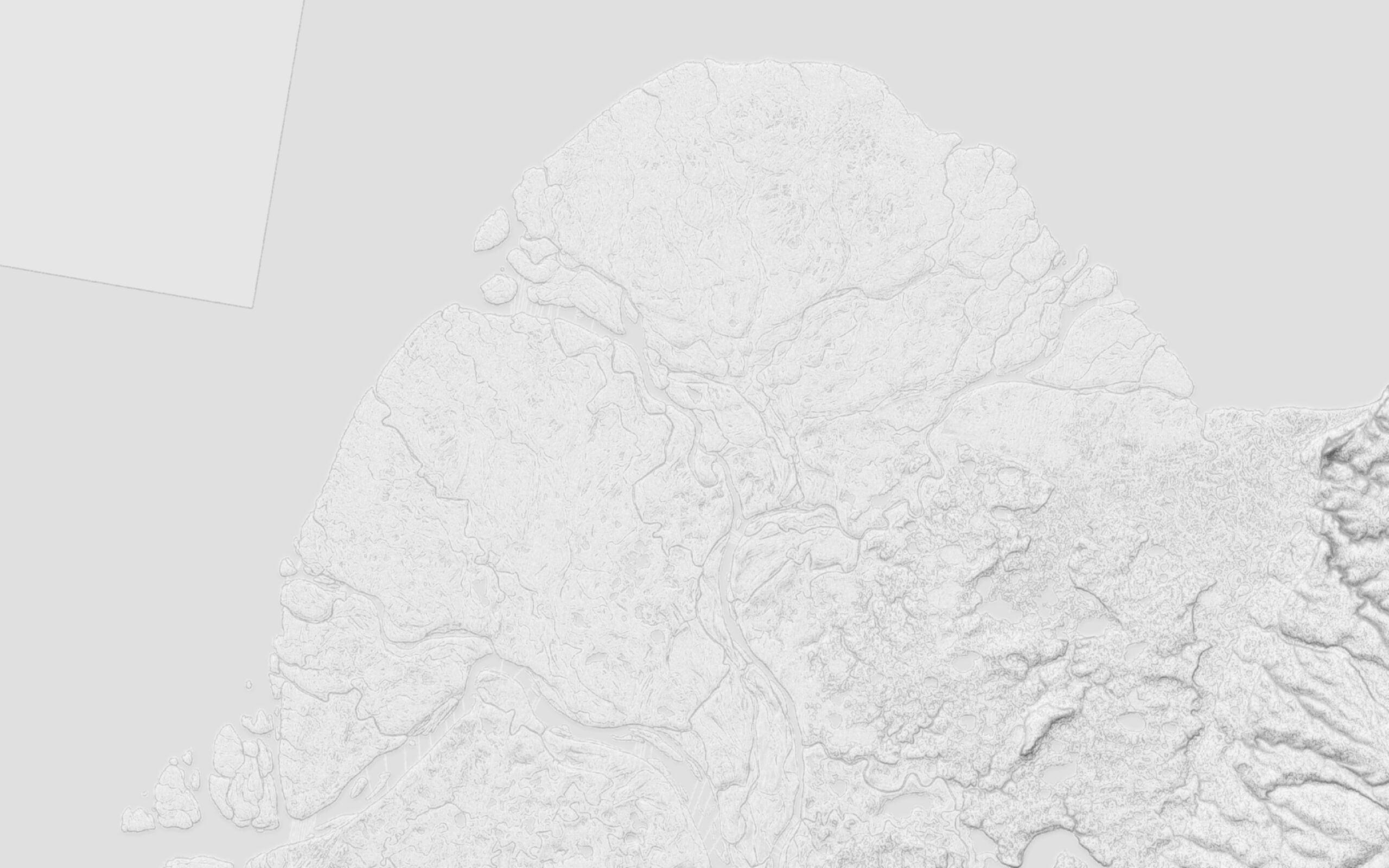
You can now use this as the base for a map. I applied the same imagery from before and a water layer and the end result turned out quite nicely:
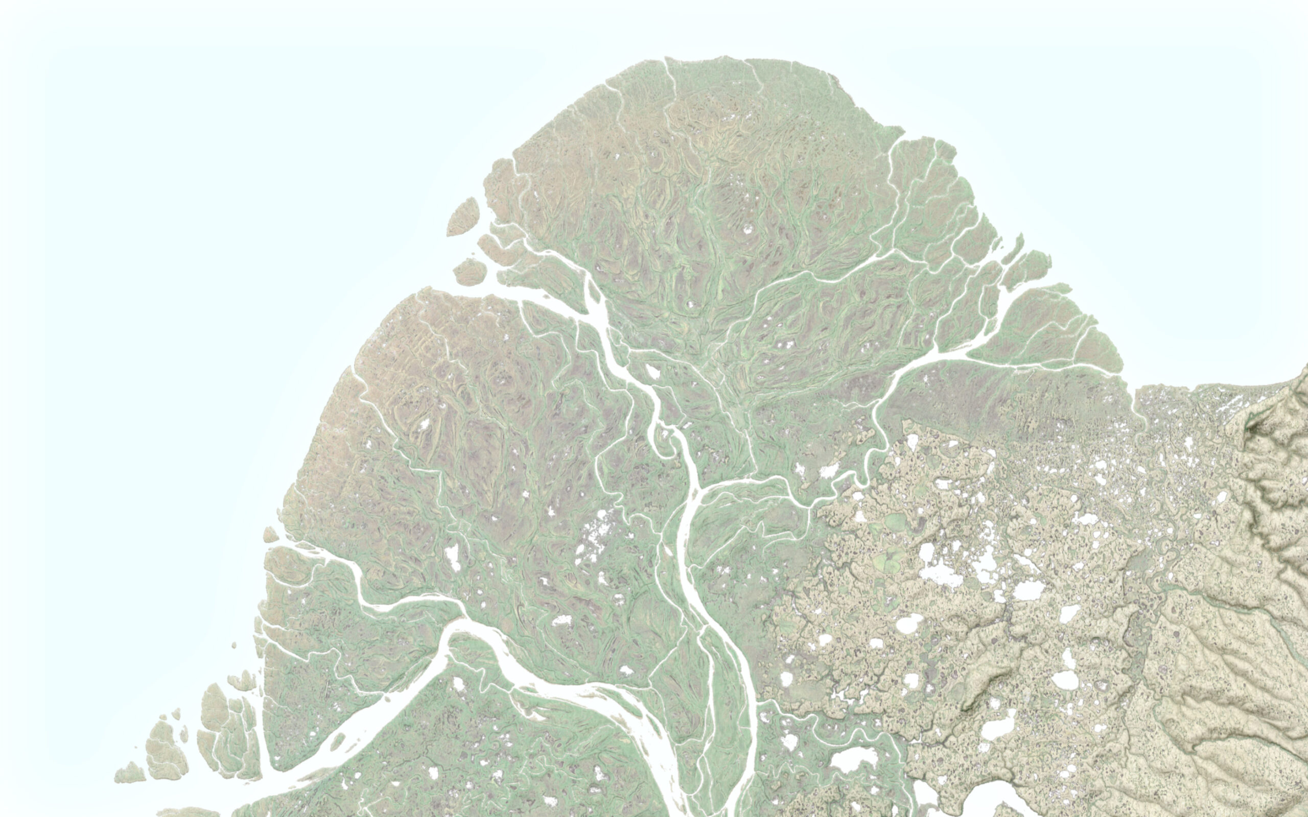
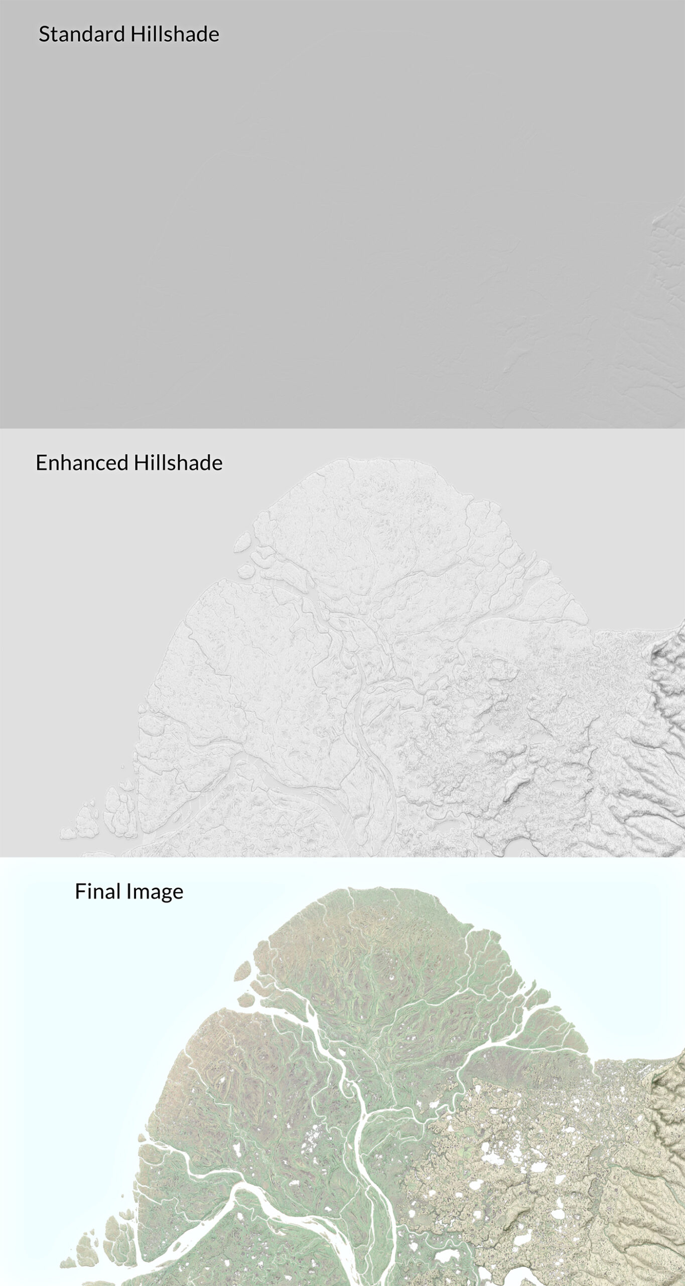
Compared to the conventional hillshade, this terrain highlights the changes in elevation from the delta itself, to the permafrost marshlands, to the foothills, while also enhancing contrast around the subtle channels and sediment fans of the delta itself. This shows the landscape better – and therefore tells the story of the map, better.
For a final comparison, here is the default hillshade and the final relief:
Last Thoughts
I like this look because it comes across as a bit more lo-fi, a bit more physical than a very high-end relief can look, and it also captures more information than just a default hillshade would either. By enhancing otherwise hidden areas in a conventional hillshade, both with hillshades and curvature rasters one can get a bit closer to a manual look.
The next part of this tutorial series will focus on what happens when you are dealing with flat and rugged areas in the same landscape, and how you can use masking to give each part of the landscape its own attention.
I want to thank Greg Fiske and RJ Andrews for their feedback and advice.
Hello,
Amazing work, I got your information from Mr. Grey Fisher, I am interested in creating maps for my country for mountains, falls etc. Please let me know if we can share a zoom call together.
Regards
Christina