I had been talking with Daniel Huffman (their site) about hachure – the historical technique of depicting landforms with vertical lines following the slope and aspect. They are a staple of the ‘historic’ map aesthetic that is often appealing today, but are difficult to replicate with digital techniques, and part of that difficulty is the extreme variety of what the word hachure may mean.
As cartographers today have taken up the task of creating digital hacks to simulate their look, I thought it might be interesting to share some examples of just how many kinds of hachure there are in the first place.
An extract from the massive Cassini map, that while similar, is not technically hachure.
César-François Cassini, 1779, sheet 151 (Briançon). View here.
Hachure is not only using lines to shade terrain artistically. It is as most strictly defined, a systematic representation of terrain that follows rules to convey accurate information about its features. Johann Georg Lehmann, a engineer with the Austro-Hungarian army, pioneered the first recognizable, systematic technique for hachure as part of his surveying work in the early 18th century.12
Hachure lines tell you where terrain is, how steep it is, how high it is, and how it is angled – all important characteristics in an era that was beginning to rely on mass artillery batteries to win battles. Hachure became so embedded in European military cartography, that, as an example, it was almost a century after the first introduction of contour lines to them overtaking hachure as the primary form of terrain relief representation in British military schools, and not without intense debate in the interim.34 The location, and accessibility, of heights was significant in 19th century warfare, something that hachure maps emphasized better than contour lines, which best show zones of exact elevation – irrelevant from a military point of view at the time.56
The technique of course expanded over time to become more artistic, more lush, and more varied outside of the needs of military surveying as the broader field of data-driven cartography developed. Which brings us full circle to the present, where we can look back on all of these different styles and evaluate their uses and differences.
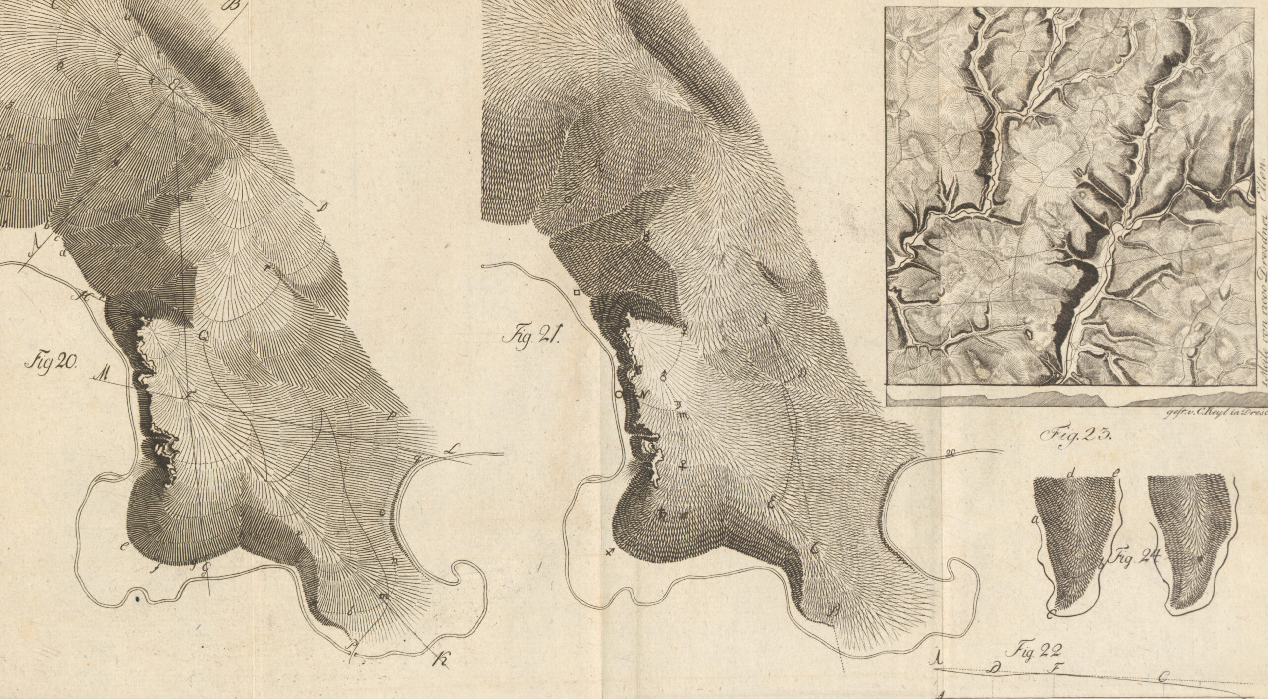
An example of Johann Georg Lehmann’s theory of hachure, published by Johann Benjamin Georg Fleischer in Darstellung einer neuen Theorie der Bezeichnung der schiefen Flächen im Grundriß oder der Situationszeichnung der Berge pg. 198, 1799. View here.
The ‘high point’ of hachure is difficult to place, as it involves many independent decisions and a constant back and forth between different groups that often reject and adopt hachure vs. other approaches at very different times. I would, in aggregate, place it about between the 1770s and the 1870s, where you can consistently find maps richly detailed with hachure in any archive filtered to this period. This is of course, a time of immense imperial expansion, scientific, political and cultural change, and these trends are tied at the hip to changes in mapping, as we will see…
This also means, unfortunately, that most ‘treasure maps’ or antique globes one sees actually don’t have proper hachure on them, as the golden age of piracy and its associated maps ended about a half-century prior to this. Hachure, is above all else, a by-product of surveying, and that field only truly reaches its fullest form after the age of enlightenment and the rise of mapping on the national, and imperial scale.
A disclaimer….
Below are some different examples of what I think are the main ‘kinds’ of hachure. These are not official names, but more my, and in cases, community categorizations based on appearance rather than author, period, or function. I am also not going to mention any modern one-off attempts at recreating hachure digitally, but only defined groups of aesthetics that have, in some rare cases, survived to the digital era.
To avoid this bloating into a entire thesis on the many different strands of history, cartography, technology and art that combine to produce these examples, I am only going to give cursory thoughts and assume a certain baseline of understanding and inference (ex. I expect the reader to know terms like contour, shaded relief, and hill-shade). My hope is that this article is a starting point to open up exploration, rather than provide the answers wholly itself.
This blog intentionally sources from many different archives. I encourage you to explore them each to see just how vast the world of cartography truly is!
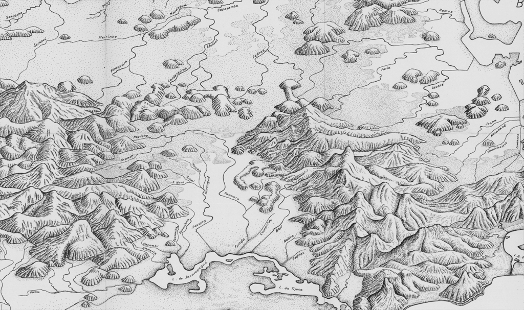
Caterpillar maps
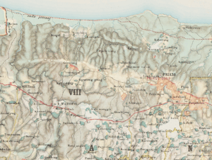
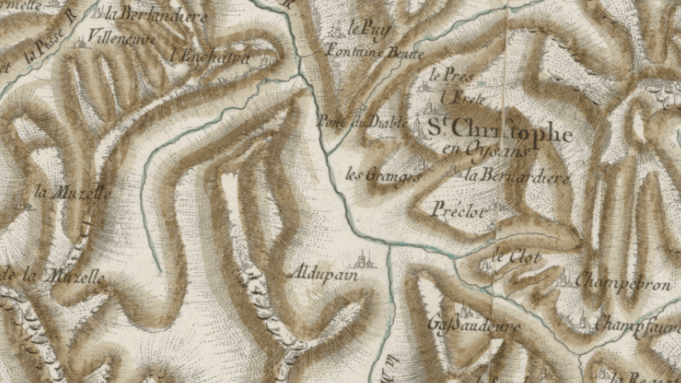
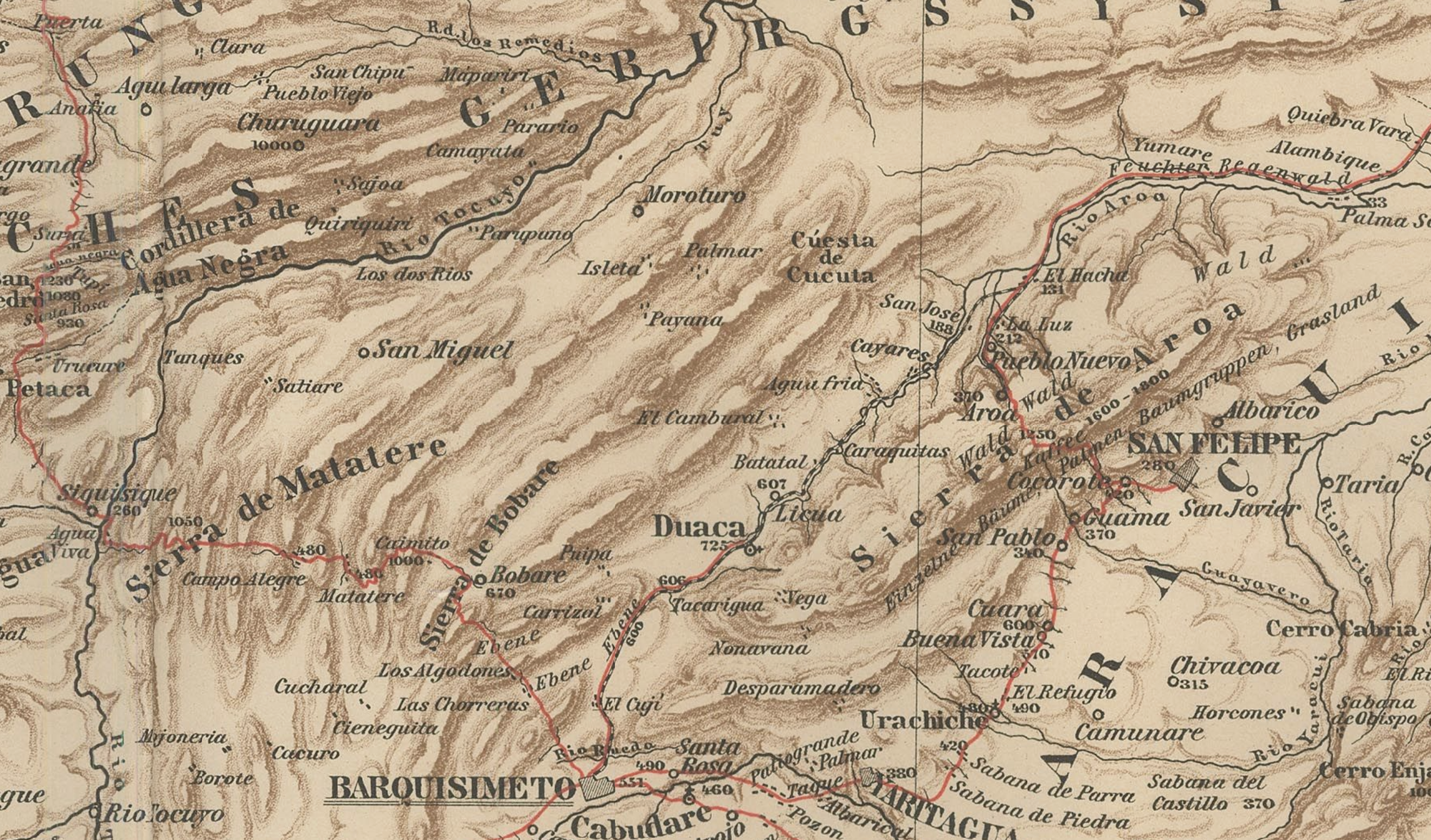
Many maps, especially those where the mapmaker had limited knowledge of the terrain, or little interest in it except as impediments to access, used hachure to outline long chains of mountains, that end up with the impression of fuzzy caterpillars wiggling their way down the map. This style shows up frequently in colonial maps, surveys, railroad maps in the mid 19th to early 20th centuries.
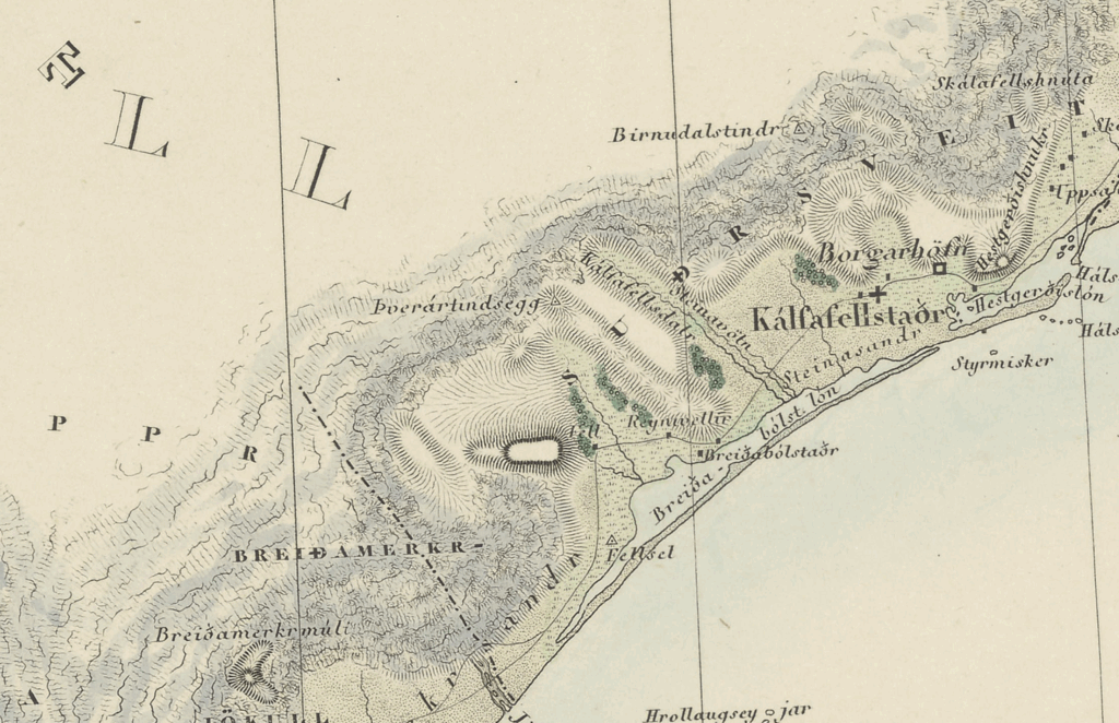
Goldfields of Western Nyassaland (note: approximately modern-day northwestern Mozambique and southern Malawi), Carl Weiss and Rowland Rugg (cartographer), 1892. View here.
This style is relatively easy to imitate, as you could plausibly just draw lines around a contour or buffer following a central ridge-line, but it lacks much of the precision of modern data, or indeed even higher-quality surveys of the time-period.
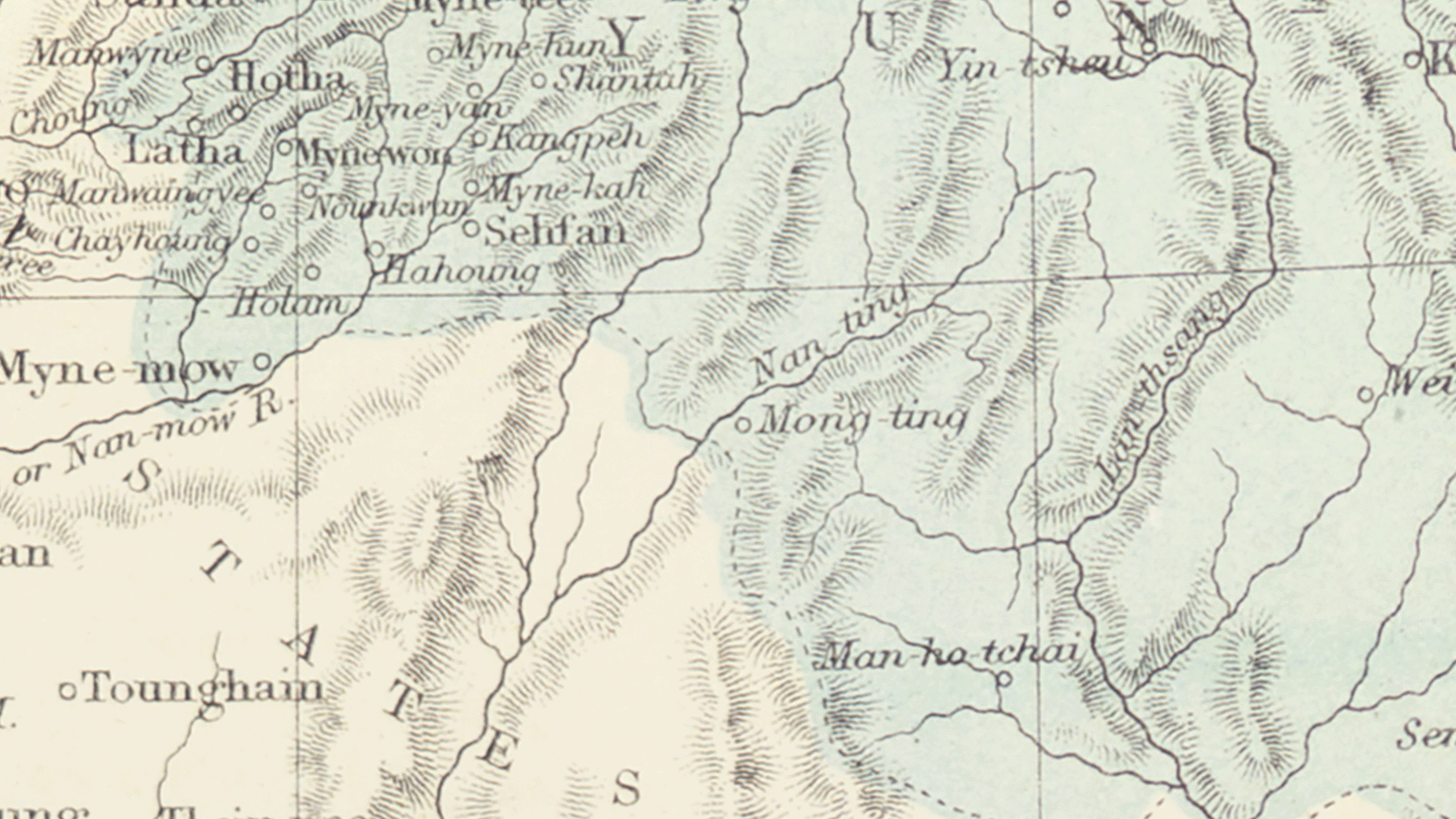
Burma-Thailand, Burma, the Shan States and Regions adjacent, John Bartholomew, 1875. View here
Many ‘Old West’ maps of the US have this style, but unexpectedly some of the austere sedimentary geology of the southwest is conveyed better in this style than in others, simply because while caterpillar maps render all mountain ranges as long strings of flat-topped mesas, those actually exist in parts of the southwest.
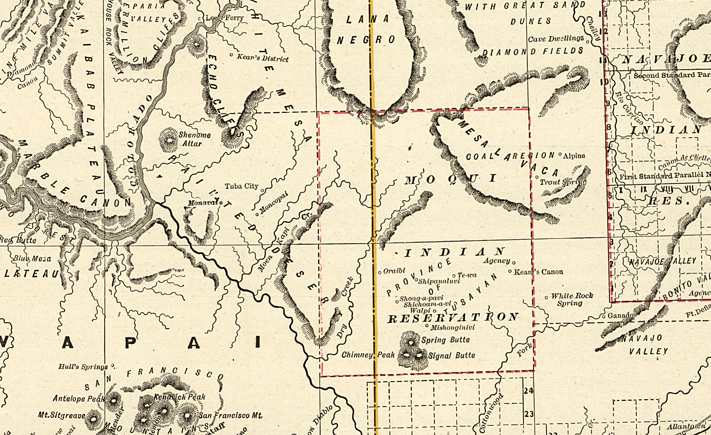
Railroad and county map of Arizona, George Franklin Cram, 1887. View here
Because so many maps that have this style are also maps that were meant for guiding the systematic exploitation of the landscapes they depict, I find the unthinking replication of these styles in poor taste.
Or rather, I would caution that in the quest to reproduce the artistry of other times, we be considerate of the value judgements that those artistic decisions represent.
Hachure and land cover
One strength of hachure is that it is only a texture, and it can flow monochromatically into any other pattern or design based on the skill of the cartographer. To convey other land features, all the cartographer has to do is to pepper in the shapes of bushes, trees, or scattered boulders among the hashes.
This is naturally extremely difficult for any digital tool to do smoothly, and it is this style of hachure that is exceedingly hard to find in any digital replica. There are an exemplary collection of maps showing this, from the French Depot General de la Marine in the 1830s.7
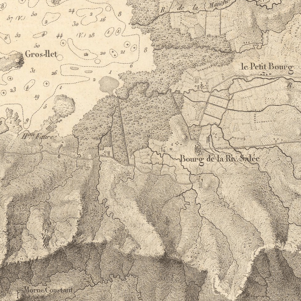
Carte Générale De La Martinique, M. Monnier (full name omitted), 1831. View here
Notice the difference in textures between the craggy ridge-lines, the fields, and wetlands. There are even spots towards the bottom right of the image where you can see lines of shrubbery just near the top of the hills. However, hills further towards the middle of the image have softer crests, and are dotted with rows of orchards. You get a full impression of the landscape without ever actually using more than 2 colors, and subtle adjustments of line position and width.
Of course, if you do incorporate color you have a even wider range of options…
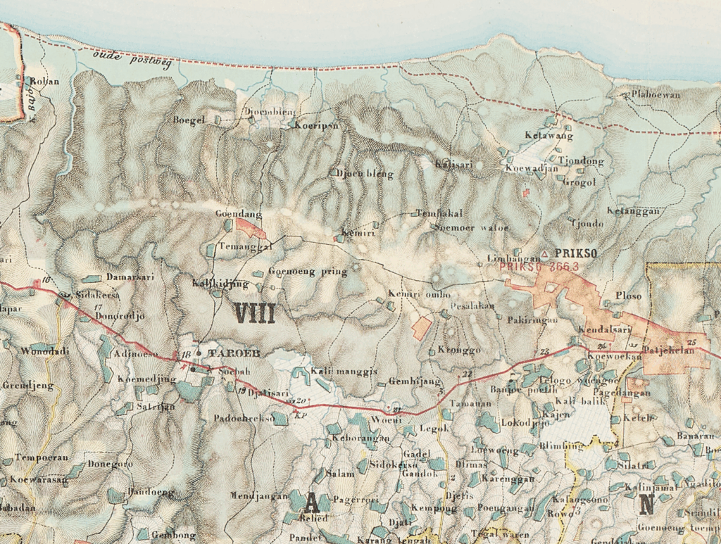
Topographische Kaart der residentie Pekalongan, Gewin Von Ballusek? 1892. View here
Horizontal Hachure
Hachures and contours existed simultaneously, and the differences between them can become so small that the former can be easily confused for the latter. Some maps use hachure in a way that produces a similar effect to contours, producing ‘fans’ or ‘terraces’ that still capture slope but follow clear brackets of elevation.
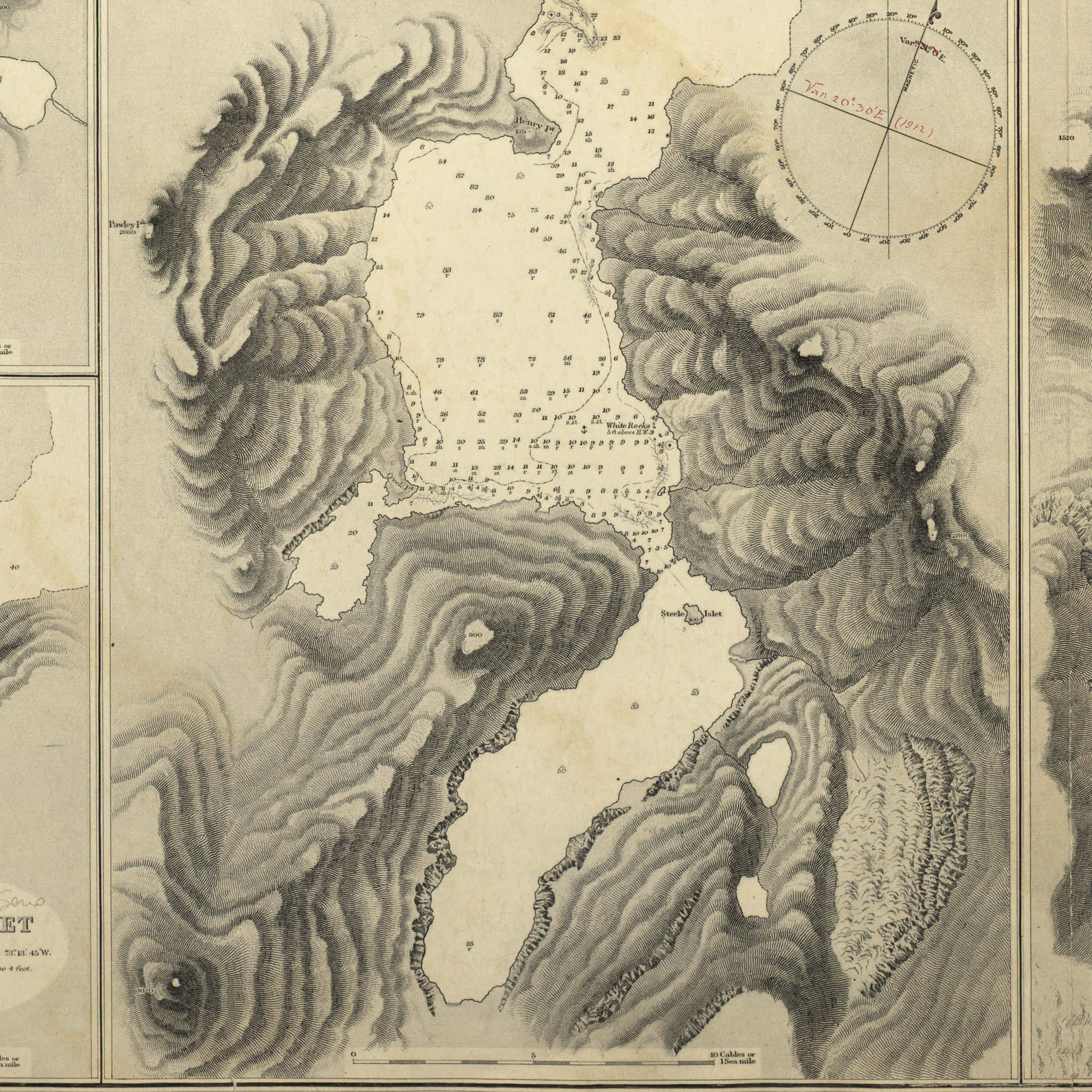
Harbours and Anchorages in Magellan Strait. William James Loyd Wharton et al., 1884, View here
Sometimes, we have what appear to be contour lines that are actually hachures. This is probably (since we can’t always know exactly the form of schooling the cartographer had) ‘horizontal’ hachure, which is at-least a feature of 19th century British military surveying schools.89
Gulf of Peñas to the Guaytecas Islands South America-West Coast-Patagonia etc., Captain Fitz Roy 1889. View here
The actual difference is the characteristic of the terrain being represented. Contours fit a particular area of elevation, and should be contiguous. Hachures do not need to be aligned to a single elevation, and can (and should) be split into singular strokes. 10 Hachures capture relief, contours capture height.11
Some maps mix both horizontal and vertical hachures:
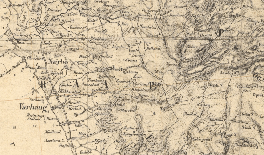
Kart over Stavanger amt. Sørlig del, 1:200.000. Søren Christian Gjessing, 1860. View here
This Norwegian map uses both types of hachure for different areas. The steep terrain of the fjords further inland are long, horizontal and curved, but as the ground splays out towards the coast the artist switches to vertical strokes, which become fully straight to show marshy, flat land.12 You immediately get the sense of not only different types of slope but the different characters of the land. Low grassy hills, soggy meadows, and steep, bouldered mounts just by flicking the pen at slightly different angles.
Hachure in 3D
Generally 3D maps use shading or stippling rather than lines. I have never seen a historical map that uses hachure in its strictest sense along with a 3D perspective – one explanation may be that in the time-period where hachure was dominant, it was actually impossible to get a sufficiently accurate 3D perspective to match the accuracy of ground-surveyed hachures, so the entire exercise would have been futile.13
However, there are scattered examples of maps that use what are often described as ‘form lines’ that are similar enough to hachures that I decided to include them here.14
The maps of Tau Rho Alpha (yes that is his name), a longtime USGS cartographer, are an excellent example.
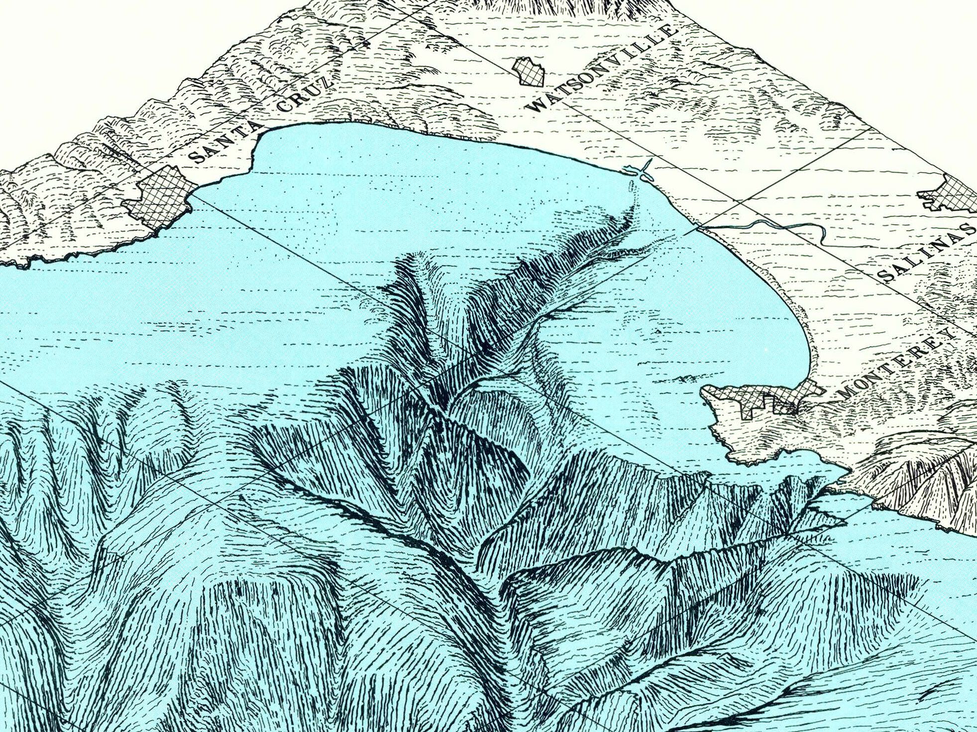
Monterey Canyon, from the Atlas of Oblique Maps, Tau Rho Alpha et al. 1988, pg. 81, View here
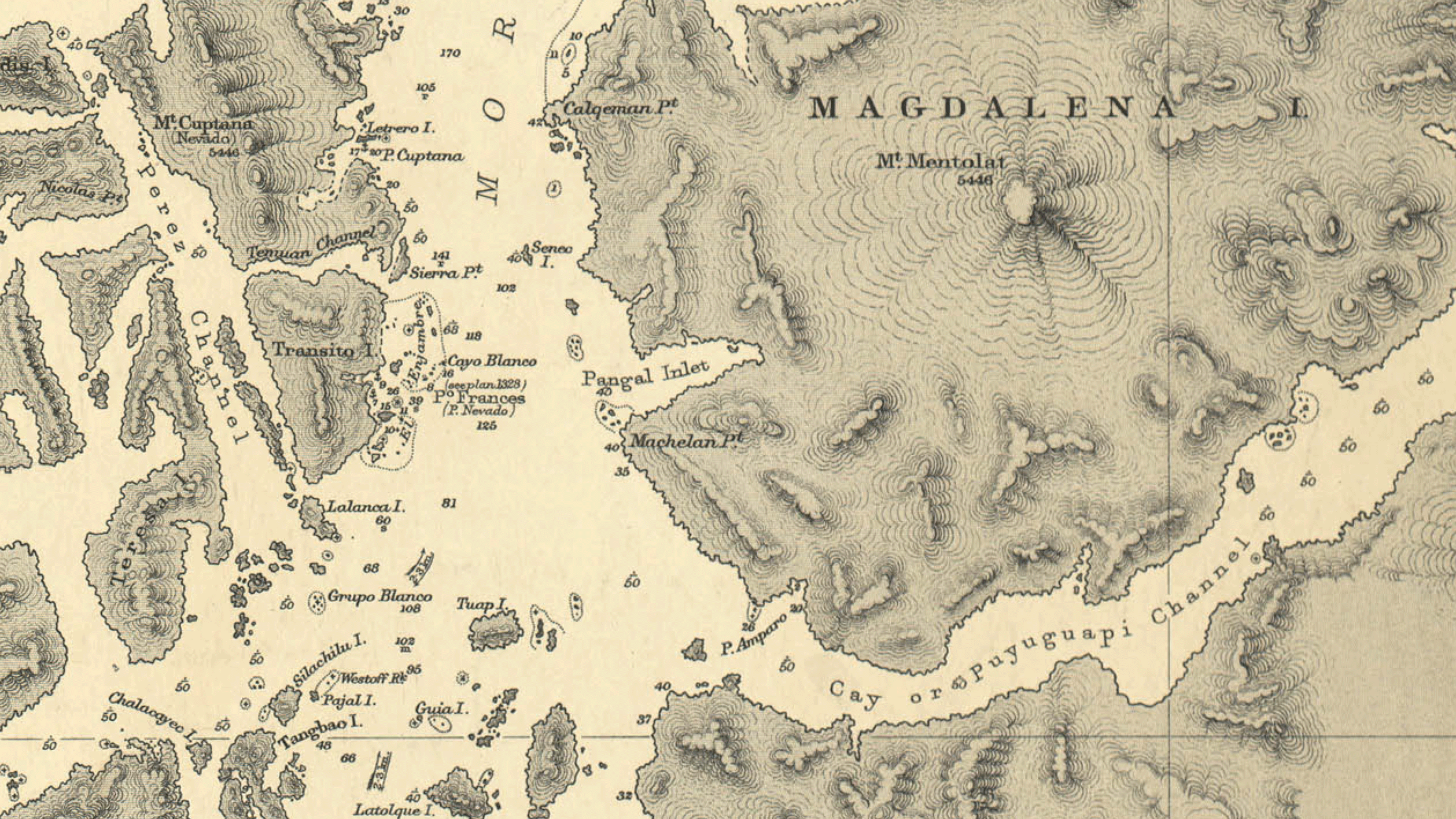
There are some good examples of these oblique maps (also called block-diagrams) around the same time from Latin America. Part of me wonders if the complex geography of much of South America where mountains, hills, plateaus, forests and lowlands all clash in comparatively short distances from each-other suits this style of visualization uniquely well. 15
Estado Da Guanabara, Relêvo e Hidrografia. Frank R. Holmes, 1965. View here16
As far as I know, there has never been a systematic survey of specifically 3D ‘hachure’ or form line cartography, so finding examples is about combing through every map from the entire time-period where hachure was used for the rare examples that are tilted. These tend to be one-off maps or series, rather than defined schools of design (the USGS oblique maps a notable exception), which makes it even harder to characterize them.
Block diagram showing terrain of the Trentino region, American Geographical Society of New York, 1918. View here
There are some 20th century (U.S.) American maps that show a quasi-hachure appearance with distinctive ‘comic-book’ strokes that are worth mentioning as well:

The Panama Canal, as seen by Charles H. Owens of the Los Angeles Times Art Staff from a special military airplane, 1928. View here
We are better placed nowadays to produce 3D hachure maps than any cartographer during its heyday could, as we can actually merge the scientific accuracy of true terrain data , and perspective with hachure in a way they could only dream of.
I stated above I wouldn’t be mentioning modern techniques here, but Daniel Huffman has serendipitously produced a range of 3D maps with programmatically generated hachure, which are a good example of what stricter hachure with a 3D perspective could be like. View here.
Hachure in unfamiliar terrain
Hachure was invented to describe the terrain of central Europe, but as European scientific industry expanded, its cartography did with it. This led many mapmakers to have to grapple with adapting techniques meant for the post-glaciated, temperate landscapes of Europe to far more diverse types of environments.
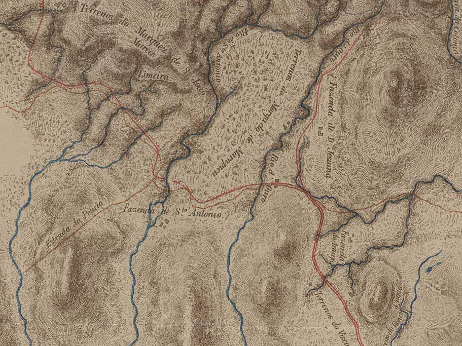
Planta Geral da Zona Explorada Entre as Cachoeiras de Iguassú e o Rio S. Pedro na Serra do Tinguá, Luiz F. Monteiro de Barros, 1874. View here
Many maps here use short hatches, densely packed together and mixed with terraces and lines that allude to vegetation or rock outcroppings. This is especially true in Latin America, which is also unique in having many independent mapping agencies that employed hachure outside of Europe during the techniques heyday.17
A series of railroad maps from 19th century Mexico illustrate this approach well:
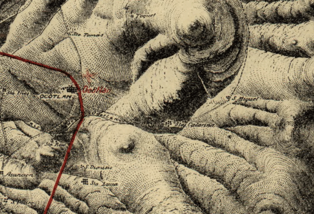
Carta del Ferrocarril Oaxaca a Ejutla, Secretaría de Comunicaciones y Obras Públicas, 1910. View here
One side point worth making is that often, stippling shows up in maps across the Americas for depicting very distinctly non-glacial rugged terrain. 18
Estados noroccidentales de Venezuela, Sociedad Geológica de Hamburgo, 1920. View here
Deserts are another place where cartographers have to wrestle with very different landscapes. Some maps of southwestern Utah in the American Southwest are able to depict its martian landscapes well with just hachures, albeit in dense pecked rows that look surprisingly similar to what you could easily ape with a digital tool.

Map of Utah Territory, W. H. Graves, U.S. Geographical and Geological Survey of the Rocky Mountain Region, 1878. View here
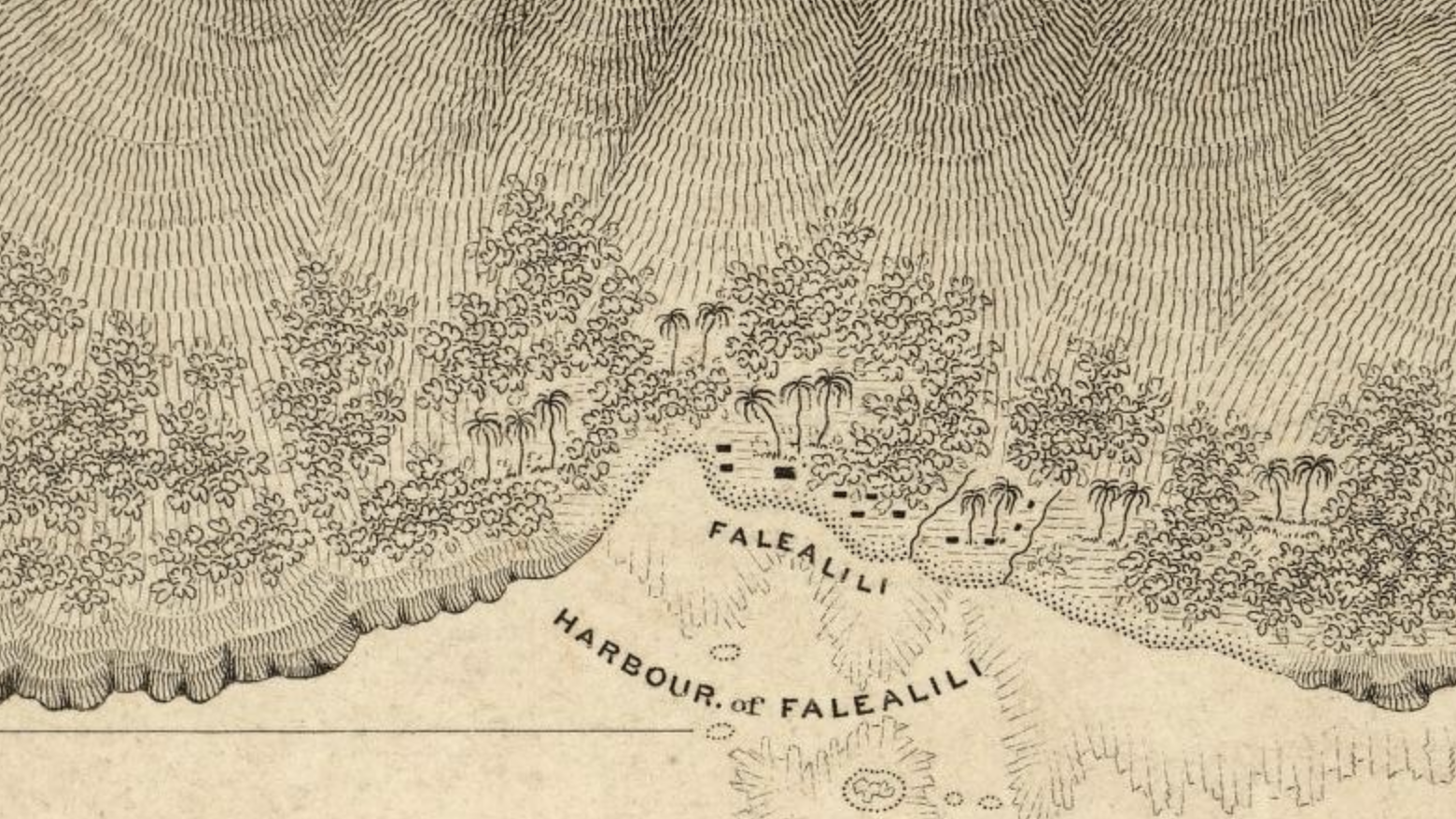
Leaving the Americas, there is a excellent example of mixing hachure and landcover to convey a lush environment in this 1839 map of Samoa:
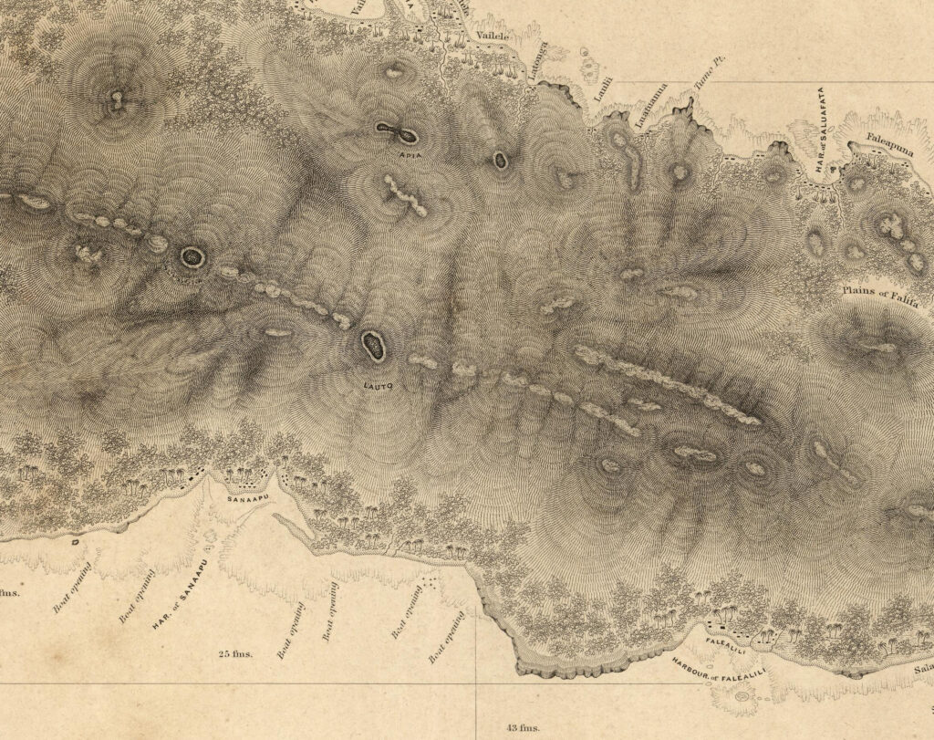
Map of Upolu Island, Samoa. The United States Exploring Expedition, 1839. View here
Notice especially how palm trees are drawn in full profile view and exaggerated scale, even while the map is otherwise a conventional overhead map:
Another disclaimer…
Part of the difficulty in reviewing these maps is that maps that include hachure, are almost always made by Europeans since that is where hachure is from, and so these maps of distant places are inevitably inside a colonial context, or one degree removed. Its valid to question whether the techniques used in the map are actually informed by personal knowledge of the landscape in such a way as to make them of cartographic interest in how hachure can be adapted to a certain area, or if the map was produced by someone who didn’t have any actual interest in that at all, but purely to represent the map as a vehicle to guide some distant colonial ambition.
One notable exception is from Hawai’i, where the Native Hawaiian missionary school graduate Simon P. Kalama produced a map of his home islands:
A Map of the Hawaiian Islands. According to the Latest Surveys, Na Kalama i kaha. Lahainaluna, 1838. View here
As a coda, there are also a fascinating series of maps from Iceland, made by Icelandic cartographers, showing shading and variation of hachure forms to convey the edges of Icelands distinct type of land-locked massive glaciers tumbling into scoured gravel plains.
Uppdráttr Íslands, Íslenska Bókmentafélagi, Björn Gunnlaugsson, Olaf Nikolas Olsen, 1844. View here
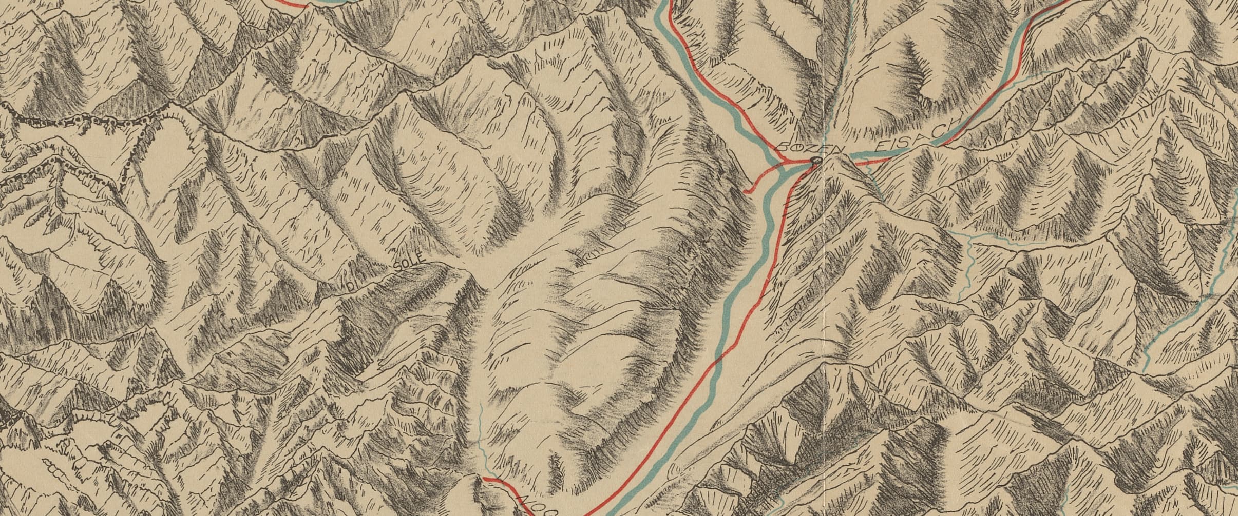
Swiss Hachure
Cartography might as well be the national sport of Switzerland, and hachure is part and parcel of that.
What the Swiss school contributed most to hachure was embracing it as a textural element rather than the foundation, to use it to accentuate the character of rugged areas over a robust base of shading. The difference between the epochal atlases, the Dufour map (1845 – 1864) which used hachure consistently, and the Siegfried map (1876 – 1920) which uses hachure only where contours would clump together, shows this evolution.
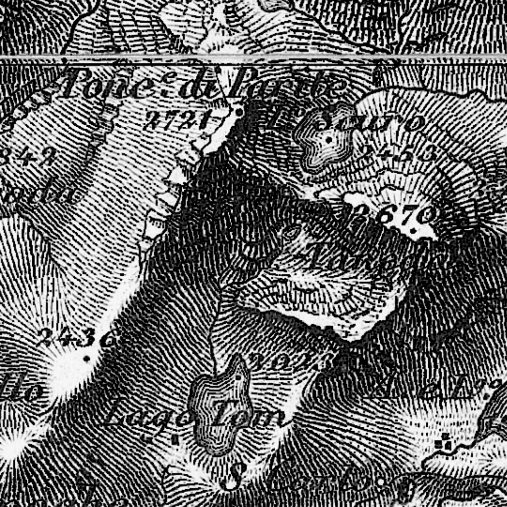
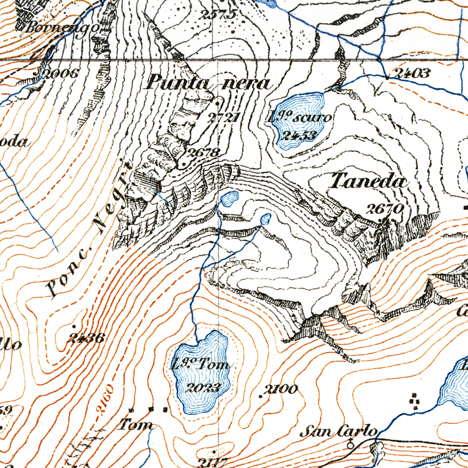
From left to right: The Dufour and Siegfried (1st edition) maps of Pizzo Taneda, Switzerland. View here
The giant of Swiss cartography, Eduard Imhof, combined hachure, contour lines, and color tone shading to produce complete depictions of terrain where hachures accentuated just the rockiest slopes.
Matterhorn und Z’Muttgletscher : Kristalline Bergformen. Eduard Imhof, 1969. View here
This Swiss style is also unique in being the only mainstream, modern and digital style of cartography that still routinely uses hachures.19
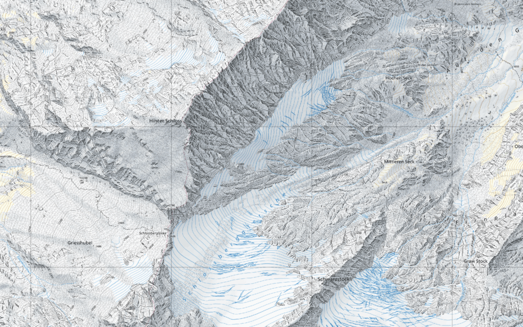
The landscape around Hinter Schloss, Federal Office of Topography swisstopo 2024, View here
Hachure in shaded relief
Hachure has always existed alongside shaded relief, and the two often overlapped and complimented each other. As we have seen with the Swiss method above, hachure can fall back to being a textural element if the shading conveys the bulk of the information.
Its a fair question to ask why hachure was so dominant when shading combined with hachure seems to be both clearer, more flexible, and more realistic. The problem is printing. If you are making a map entirely by hand, you can of course shade and draw to your hearts content (and throughout the 19th century in particular, hand-drawn survey maps sometimes did use ink shading combined with contours). However for printing, you are bound by the technology of your time, and the ability to accurately print smooth color tones came long after the ability to print lines. This is why, though both hachure and the principles of shaded relief had been known for almost 200+ years, we only get maps combining the two in the mid-20th century.
The 1911 Chevalier map of San Francisco, uses a combination of brightness and hue to suggest at once, land cover and hill-shade, then it accentuates steeper slopes with delicate hatching. (A excellent tutorial on recreating this maps aesthetic is here).
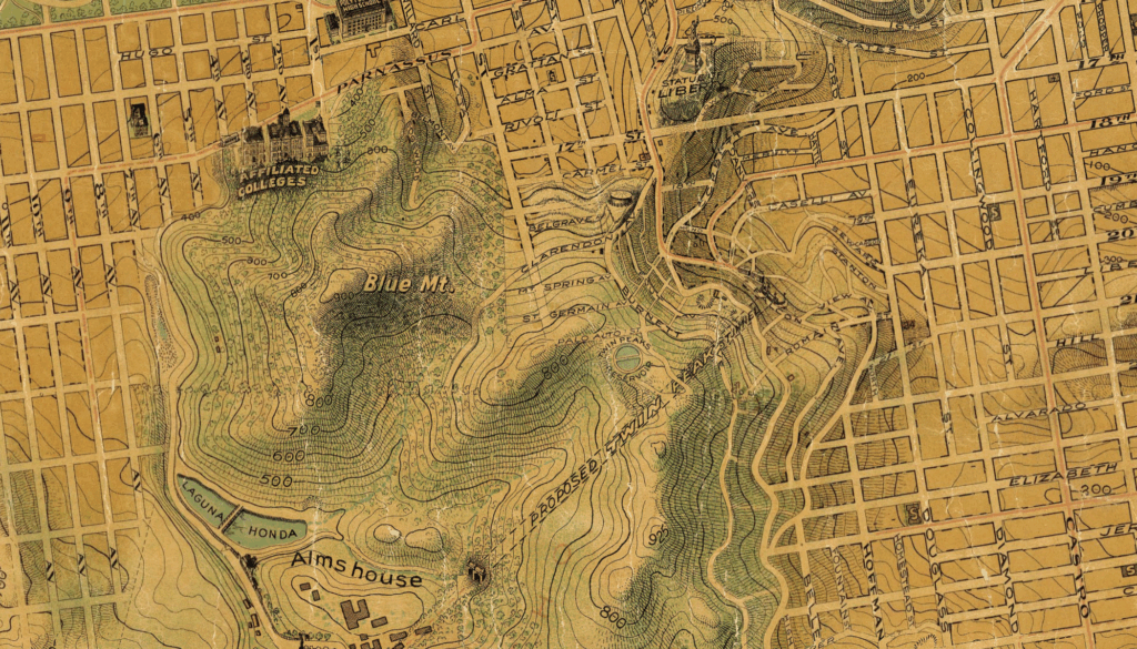
The “Chevalier” Commercial, Pictorial and Tourist Map of San Francisco From Latest U.S. Gov. and Official Surveys, August Chevalier, 1911. View here
In the 1960s, we get airbrushing – or using a jet of compressed air to scatter paint evenly – and truly seamless shading becomes possible. 20
The apex of airbrushing and hachure is perhaps the Bradford Washburn map of Mount Everest:
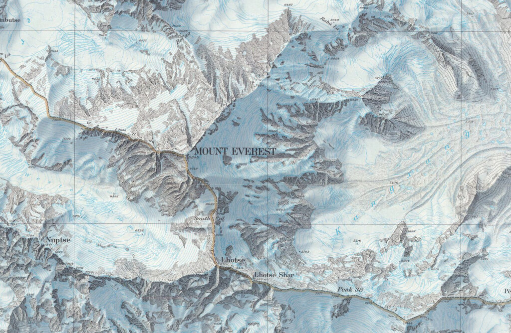
Mount Everest, (The) National Geographic Society, 1988. View here
The shaded relief sets the foundation, and lighting, while the hachure accentuates the different types of relief. This opens up much of the space of the map for other purposes, like labelling or more finely depicting land cover. Maps like this, paradoxically, represent why hachure has nearly disappeared. With contours providing elevation values, and smooth shading providing the background, there is no need for hachures to full the map and deprive space that can be used for other purposes.
With more modern printing techniques that can replicate smooth tones a wide variety of colors, theres no need for meticulously drawing thousands of strokes to convey relief. Hachure shrank to just the crags, and then altogether vanished, in nearly every form of mapping as the digital age approached.
Digital hachure
It should be said hachure did not entirely disappear in the digital age, as we just saw with the Swiss-style (though that is still mostly drawn manually, just using digital devices). Examples of fully digital hachure are rare owing to how difficult it is to reproduce, but some radically modified varieties do appear. Some archeological surveying guides in the 21st century suggest hachure as the preferred way to show a precise and defined slope.21
Especially in the British Isles, with both such a rich surveying tradition and many earthen heritage sites that require mapping defined ridges in topography, site survey maps still often show large hachure marks along slopes.
Interpretative plan of Warkworth Castle, with features from geophysical surveys recorded, north at top, Castle Studies Trust, 2021. View here
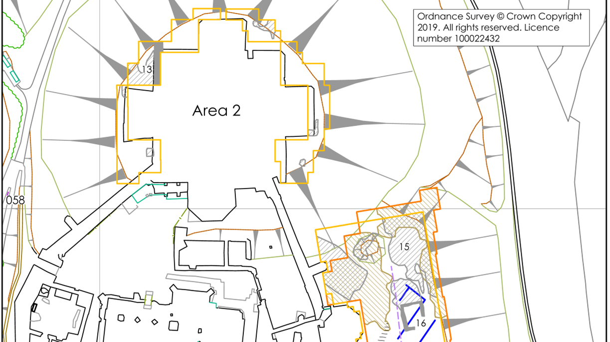
The UK Ordnance Survey also uses hachure in limited locations, like around the Western Heights (bottom right) visible below:
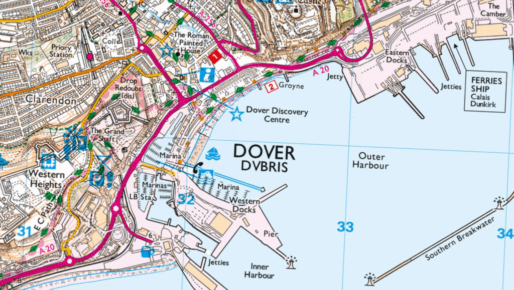
Ordinance Survey Explorer map, 2022. Preview image from here
Ultimately – I like hachure. I also understand why it went away, and it speaks to a broader trend that happens when the tedious technique of the past is replaced by a convenience of the present. People rush to adopt the latest, fastest, most accurate technology, but then as time passes look back on the artistry and effort of the past with nostalgia, but do not want to actually rely on it anymore. So they find new ways to do old things, and find a balance between the two. We add static back into digital music to make it sound ‘lo-fi’ and we shop at farmers markets between ordering take-out. We can learn from the past, and appreciate the present at the same time.
Hopefully these examples give you something to chew on as you pursue your own cartographic (mis)adventures.
Footnotes
- Wolf Günther Koch, “J. G. Lehmann’s system of slope hachures – an investigation on the quality of relief representation at the beginning of the 19th century,” (presented at the International Cartographic Association ICC Conference, Dresden, August 2013), Extended abstract accessible here: https://icaci.org/files/documents/ICC_proceedings/ICC2013/_extendedAbstract/265_proceeding.pdf ↩︎
- Johann Georg Lehmann, Darstellung einer neuen Theorie der Bezeichnung der schiefen Flächen im Grundriß oder der Situationszeichnung der Berge (Leipzig, Johann Benjamin Georg Fleischer, 1799), Accessible here: https://www.e-rara.ch/zut/content/zoom/512414 ↩︎
- A great discussion of exactly what occurred in this 80 year period is in Yolande Jones, Aspects of Relief Portrayal on 19th Century British Military Maps, The Cartographic Journal 11 no. 1, (1974), Accessible here: https://www.tandfonline.com/doi/abs/10.1179/caj.1974.11.1.19 ↩︎
- Karen Rann, The Appearance of Contour Lines on British and Irish Maps, 1778–1870, The International Journal for the History of Cartography 72 (2020), Accessible here: https://www.tandfonline.com/doi/abs/10.1080/03085694.2020.1748935 ↩︎
- László Zentai, The Transformation of Relief Representation on Topographic Maps in Hungary: From Hachures to Contour Lines, The Cartographic Journal 55 (2): 150–58 (2018), Accessible here: https://www.tandfonline.com/doi/full/10.1080/00087041.2018.1433475
↩︎ - Obviously not irrelevant for engineering maps, and that is why the frequency of contours vs. hachures varies based on the intended industry of the map throughout the 18th – 20th century. ↩︎
- Many of these maps show a mastery of metal engraving, a unsung component of maps of this era. There is a excellent discussion of engravers (some of whom were women) here: https://blogs.bodleian.ox.ac.uk/maps/2020/05/18/unsung-heroes/ ↩︎
- Jones, 1974, pg. 22 ↩︎
- You can read some original text describing horizontal vs. vertical hachure in the ‘english style’ here: https://archive.org/details/practicalcourseo00lend/page/11/mode/1up pg. 13 and onwards. ↩︎
- Patrick Kennelly has a good overview of, and method for producing, horizontal hachures here: https://mountaincartography.icaci.org/activities/workshops/banff_canada/papers/kennelly.pdf ↩︎
- Bathymetric contours were actually used more frequently, and earlier than their equivalents on land were, because depth matters much more than the relief of the seafloor from the perspective of safe navigation. The original article is in french (Dainville, 1986) but a brief summary of its findings are in the U Chicago History of Cartography, Volume 4, pg. 1434. View here: https://press.uchicago.edu/books/HOC/HOC_V4/HOC_VOLUME4_T.pdf ↩︎
- Google street view of this part of Norway can still give you a good sense of how accurate this map is to the tripartite division of terrain from the flat coast moving further inland. ↩︎
- It was common in the 19th to make oblique maps ‘of the seat/theatre of war’ that showed the landscape of a conflict for popular newsreaders. One military manual gives a explanation for why hachures are not appropriate there as a scientific tool, “Perspective has also been tried in combination with a horizontal projection, as may be seen in old plans (Plate XXYII.), but this method of bird’s-eye view drawing is too inaccurate, and it is now con¬ fined to those popular maps which are published for the million in time of war.“
Captain August Frédéric Lendy, A practical course of military surveying :including the principles of topographical drawing (Atchley and Co., 1864), pg. 18. View here: https://archive.org/details/practicalcourseo00lend/page/n4/mode/1up
↩︎ - Where a form line and hachure differ is in the core type of information being conveyed. One might consider a form line to focus more on physiography than the mathematic value of ‘slope’. Erwin Raisz, a inspiration for Tau Rho Alpha and the USGS team, is quoted here on the topic. ↩︎
- The Brazilian geographer and cartographer João Soukup considered blocodiagramas as their own category of maps for his diagrams of mapmaking styles and tools. View one example here: https://publicacoes.agb.org.br/boletim-paulista/article/view/1342/1208 (pg. 6) ↩︎
- This map looks very similar to the style of Percy Lau, a ubiquitous artist and cartographer who was active in Brazil at the same time, which makes the simalarity likely more than a coincidence. ↩︎
- Though the truth is complex here. Many icons of Latin American national cartography were either directly of European birth, like Antonio Raimondi who led the first comprehensive national survey of Peru (and was from Milan), or serving inside self-styled European governments that had a attitude towards their own peoples not that different from a colonial state. This is another example of how cartography is inseparable from the politics of its time, especially in the case of the national mapping enterprises that had the resources to produce the sort of detailed, rich cartographic work we aspire to reproduce. ↩︎
- This is also true for many places in Africa, especially around the early 20th century. (The map of Malawi here is a good example). ↩︎
- A great review of how modern cartographers produced hachure for Swisstopo is accessible here. ↩︎
- Sometimes too smooth – Hal Shelton, the legendary USGS cartographer, chose painting over airbrushing since he thought the former looked more natural. You can read more here: https://mountaincartography.icaci.org/publications/papers/papers_nuria_04/patterson_kelso.pdf ↩︎
- A great description of one method for modern survey hachures is written here: https://billboyheritagesurvey.wordpress.com/2014/03/13/the-slippery-slope-cad-hachures/ ↩︎