I promised I would release a 30 Day Map Challenge highlight gallery when the challenge ended in…November. Well, it is not even that year anymore. That is the case with a lot of projects. You get the idea at a different time than the time and energy to carry it through.
I was lucky that this years challenge came when I had just enough time to work on these daily projects in between my professional ones, and the personal space to properly recover and consider each new idea. Before I say anything further, I want to remind all of the readers that artistic work of any kind is not measured just in brush strokes or pixels, but the mental energy needed to produce something out of nothing.
Before I show off some of my efforts, I want to highlight some other peoples work that impressed me over the course of the challenge. I will not pick a map for every days theme. I want to rather choose only a few that deeply inspired me, so I can talk more at length about what I appreciate about them. Then, I will do the same with my own maps (and don’t worry, I have my entire collection for the 2021 challenge linked at the bottom of this page).
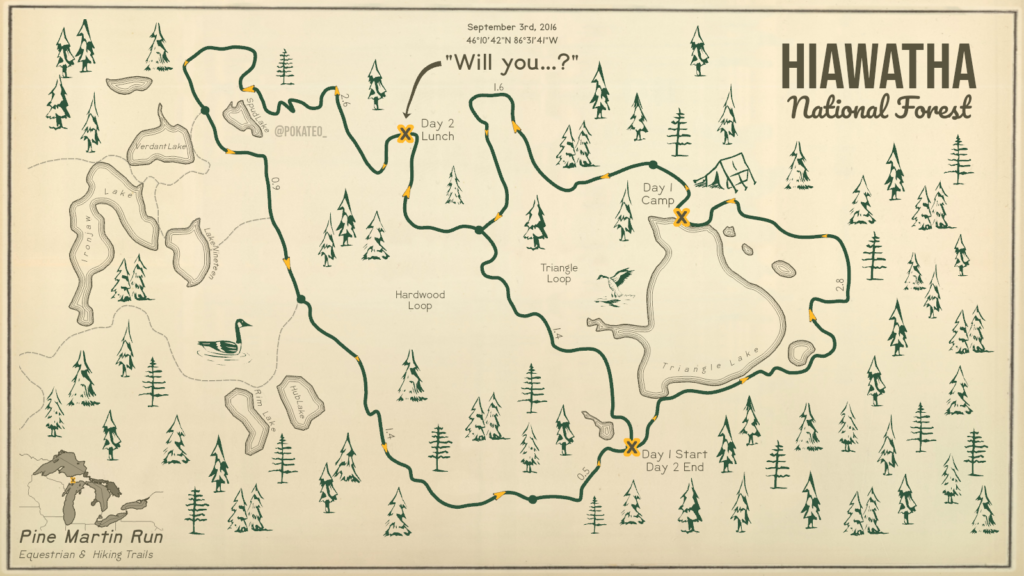
Hiawatha National Forest
Kate Berg | @pokateo_
Day 2 | Trails
Kate always brings out the human touch in the cold world of digital maps. So much of what we (cartographers) do, in any field, is emulating or trying to emulate the design of handmade works. At the same time, the beauty of digital technology is that you can make a map like this that has that wonderful old-fashioned look but can be made in less than a day, with accurate data. The trick is knowing where to disguise that efficiency. Kate does that masterfully here.
I want to highlight some parts of the design here that work really well. First off are the colors. Green and yellow is not a common color scheme in isolation. In my experience, they are both these secondary colors – they do not evoke the same strength of feeling ordinarily as red, blue, or black. Modern color rendering also means it is very easy – in fact much easier, to make a unholy garish neon death-beam than a charming yellow or green. Part of what makes ‘vintage’ vintage is that before modern technology your abilities to create color were more limited, and then time would fade any colors you do create. Kate picks two colors that are a bit faded, a bit ‘off’ from a pure color (the yellow is leaning into a orange, and the green just has the slightest hint of darker blues or even purple in it), and then sets them against a faint eggshell and brown. Almost like the map itself has been burnt into wood. With these colors alone the map would look good, but to pair them with gentle, nice thick lines, handmade tree stamps, and those old-fashioned contours around waterbodies combined makes this as soothing as a cup of cocoa on a winters day.
I have not even touched on the core story of the map – the journey she and her husband took before he proposed to her. As well designed as a map may be, if it is clashing with the story and audience of the map then its not really that well designed overall. If this exact same map was being handed over to a surveying team trying to find a place to put a water main…it would not work very well. Alternatively, if you designed a memory of a beautiful romantic moment like this as if you were plunking out survey maps, PLSS grid and all, than I would question your social skills. Kate picked the right aesthetic, paired with the right colors, for the right story and it comes together to a wonderful piece of art.
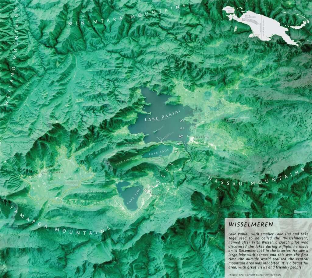
Wisselmeren
Briantama Asmara | @brayents
Day 7 | Green
I have made plenty of comments about Blender hillshades being overused – to the point where the great wheel of internet drama is tipping back around towards them being needlessly pilloried. I think this is a great example of how a Blender hillshade can look beautiful. The entire map has this ethereal quality to it. There is depth, but not like a old worn sculpted map you may find in a local museum but some sort of futuristic projection you pan across in a starship deciding where to send down a shuttle. Briantama is a master of restraint with labeling. They are these delicate wisps of text that sit on the mountain ridges. The white text combined with the shadows on the lakes creates this feeling of vertically like you are peering through clouds of words down to the surface.
From a more practical angle, it is very difficult to make good maps with satellite imagery. Imagery is complex, ever-changing, and noisy. It rarely cooperates with other datasets well. You need to work around the imagery, strategically inserting information in those rare spaces its possible without overwhelming that area with visual detail. Imagery is also dark. Much darker than one may think. If you average out a satellite mosaic (lets assume a true-color rgb image you’d get spat out from glovis, or GEE), you will find the color usually desaturated, and muddy. Going back to my discussion with Kates map, very bright clean colors are with rare exception (snow!) a luxury of the digital age.
You have to tailor your map not only around the colors, but how frequently they change pixel to pixel. Notice how Briantama pushes labels into areas of clear negative space. Not only waterbodies, but in valleys between ridges. He then allows the labels to follow the natural directions of the landscape. As a rule, if you notice a label…doing…label..y things, its not working. There should be a seamless transition from seeing, to reading, to looking beyond the label, to understanding the information. Braintama’s map does this while maintaining a consistent aesthetic to the labels themselves, and the beautiful extent map in the corner is just icing on the cake!
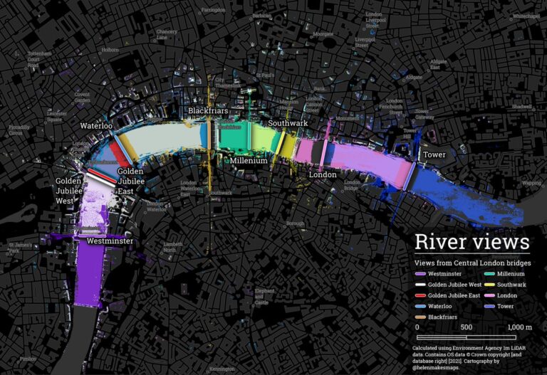
River Views
Helen McKenzie | @helenmakesmaps
Day 10 | Raster
Perhaps it is because I recently travelled to London (my first proper vacation since the pandemic started – so about ~3 years as of the writing of this post), but I am vulnerable to being amazed by maps of that city at the moment. London is a mountain of history smushed into itself a dozen times over, and that creates all of these little nooks and crannies of fascinating things. For most of its history, London had just the one bridge (the – London bridge), which rapidly expanded in the 18th and 19th century.
Why does this matter? Because, some of my favorite maps take a dataset and show something in it, that was hidden at face value. Like revealing some lost structure in London itself, Helen took LiDAR data and calculated viewsheds on it to show the way the different bridges create these ‘views’ of the London waterfront. You get this idea of the river Thames itself, and then how that riverfront aspect of the city leeches out into nearby avenues that lead directly onto these bridges.
Anyone who has seen my work, or is reading this website, knows that I lean heavily towards ‘light mode’. Most dark mode maps I have seen, I think would work just as well as lighter maps. Here however, the dark mass of London makes the bright colors of the various bridges shine out like a burst of color in a dark theatre. Its cinematic in every way. Yet, there is just enough detail outside of that to keep the entire map feeling cohesive , guiding you towards the area of interest with intent rather than forcing you through a absence of anything interesting anywere else. Then, by subtly adjusting the weight and shadow of labels, Helen creates the same effect of depth as Briantamas map earlier. You feel like you are peering through layers of information rather than a single flat one.
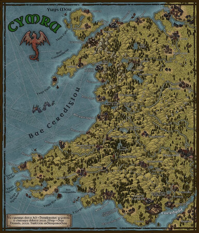
Cymru
Dan Harris | @DiasporaDan
Day 14 | New Tool
The internet age has supercharged fantasy cartography. A explosion of new tools, forums, artwork, and media has allowed this niche to expand so much that to many people, it is their first experience of maps and how to make them. This new fantasy cartographic canon combines antique aesthetics with modern software and sensibilities to produce something very new altogether. Fantasy to me, represents the most exciting current frontier of the entire field of cartography.
Part of what I find so fascinating about it, is how you can reveal what it does to our sense of a place, by taking that style and applying it to a real location. Dan Harris is one of my favorite cartographers, and he and I actually worked together on another map of Wales that borrowed heavily from the art of John Howe and Alan Lee, two artists who often made scenes from Tolkiens lore. In a odd historical twist, by drawing so much from Celtic languages when designing Elves and Elven languages, fantasy artists have given Celtic regions a new fantastical flair all their own.
Dan used Inkarnate to make his map. It is a very popular tool for making fantasy maps. By intepreting Wales through it, he makes Wales seem like it leaped from the pages of a DnD manual. Its a great way to see how fantastical imagery can turn the ordinary extrordinary. Not only that, but the map itself is in Welsh. I always love seeing maps in less widely known languages, and especially one that has been used so much for inspiration in fantasy, but has rarely been celebrated in its own right as a language of its own deep mythic and literary heritage. Just looking at this map, you can easily imagine the Wales of Taliesin, or King Arthur.
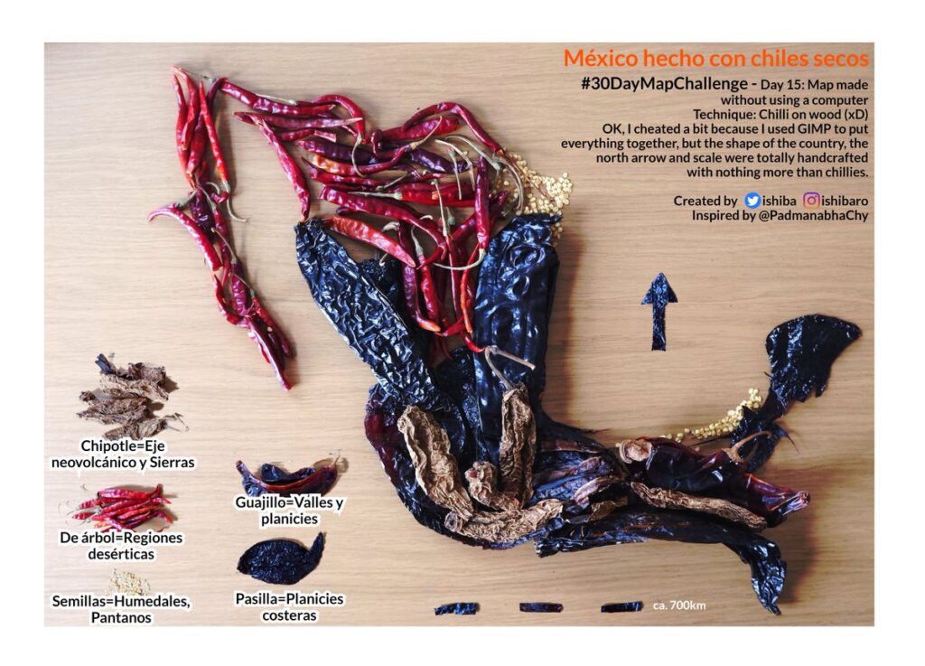
México Hecho con Chiles Secos
Israel Hinojosa Baliño | @ishiba
Day 15 | Map made without using a computer
This map made me hungry. More than that, it made me kick myself I did not come up with this idea first. Not that I could have done it any better. The challenge day when people are forced to get off their computers and express themselves in reality always features a burst of creativity, even as I pine to return to my cave and the cold glow of a screen.
I noticed many people used objects they found around them to represent spatially something that all of those objects had in common. Some common association, usually the country the person was in or a particular place of significance. Here, not only is the object of the map deeply linked to what the map is, but the objects themselves (the chilis) have been artfully arranged to accentuate their own forms as well as the greater whole. Even the spare seeds that I am sure were all over the place while preparing this map were hoarded together to fill in parts of Tamaulipas and Campeche. I love the legend too. It is a clever mix of the real with the digital that keeps the larger theme of the map. Not to mention the scale bar and north arrow.
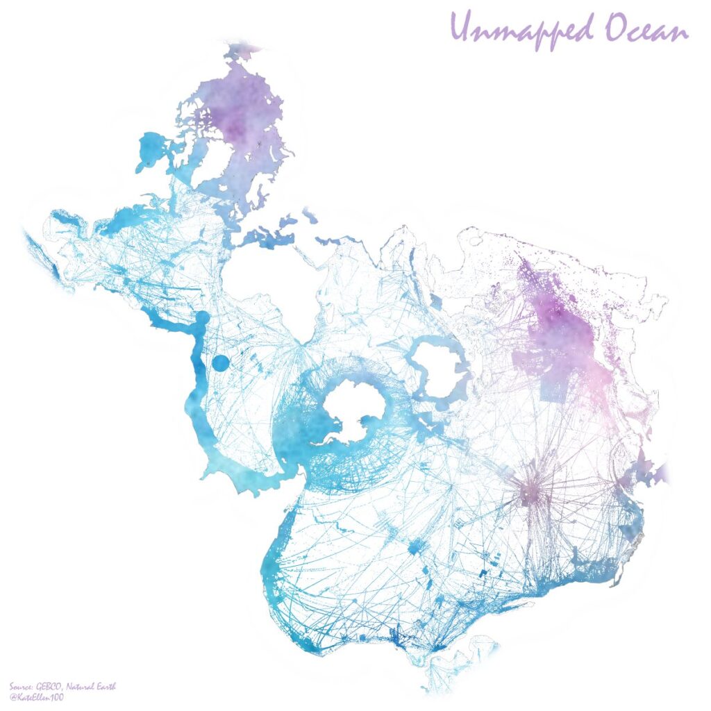
Unmapped Ocean
Kate Ellen | @KateEllen100
Day 29 | Null
This map was all over twitter, and for good reason. It says so much with only one dataset, and invites the viewer into it so they wonder about all the stories underlying the many jags and strips of the data. I want to first talk about the concept of ‘nothing’ , and then about why I think this map not only excelled in demonstrating the concept, but also what it did to take its own design to the next level.
Oftentimes, growing up out west (and I suspect this is in general the case for the US at large) people will say ‘oh theres nothing out there’ when referring to a place. When really, there is no such thing as nothing on Earth. On a highway, when you see a open expanse of grass and say ‘nothing’, really its the absence of development that you see. When we (meaning generally mainstream cartographers) make maps, often we place figures over water which is some blank shade of color. Really though, that water is full of ‘things’. Sealife, a seabed, vegetation, different sediments, currents, human detritus, different temperatures and layers of water. When there are maps made of the ocean, often we look at those tiny specks of land in it and say that is the something, rather than the immense expanse around it.
This map shows the extent of GEBCO coverage for the global ocean. By highlighting the thin strings of data over these huge areas, it points out that what we think of as ‘data’ is really small parts of a much greater real thing that too often is ignored because it simply does not fit our notions of what ‘something’ is. Theres a few simple design decisions that emphasize this. The spilhaus projection is a fantastic way to create a more ocean-centric point of view, as is the gorgeous watercolor fill where there are data strips. I also like how there is no detail on the land except for the thinnest coastline edge, just to prick out that divide and set the entire map into its background. Theres a clear difference between the negative space of the land, and the negative space of the unmapped ocean. They’re the same color, but saying two totally different things. I couldn’t think of a better way to execute this particular story.
The 2021 challenge produced many beautiful maps, far more than I could ever share here. So in no particular order, here are some other individual maps I thought deserved a spotlight
I of course would be remiss if I did not mention Greg Fiske, my talented colleague and mentor, who contributed a few maps to this years challenge as well:
My Submissions
